Guided by the philosophy of less, but better, their mission is to design high quality, easy-to-use skincare, fragrances + candles that fit into your modern lifestyle. They are honest about ingredients and their products are meant to be gentle, effective and efficient. Less steps in your routine, less packaging, less fuss, less waste.
Taking roots in the founders’ backgrounds and passions, design has been at the heart of everything the brand does, from the packaging to the formulas, taking pride in being designed for all – all skin types, skin tones + genders. Since its launch 19 years ago, MALIN+GOETZ has evolved from a 13-skincare product line and one neighborhood apothecary into a true global lifestyle brand spanning six continents and five categories - face, body, hair, fragrance and home.
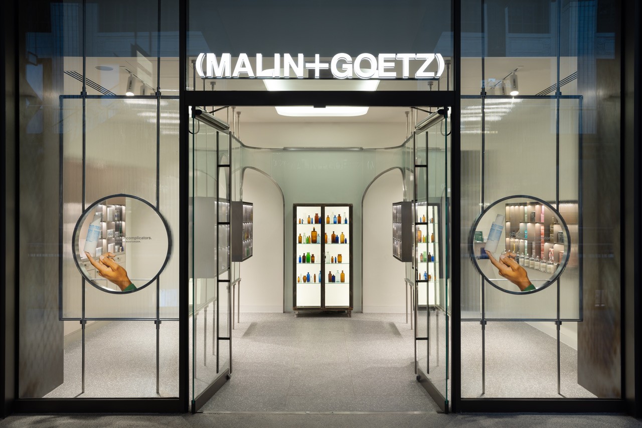
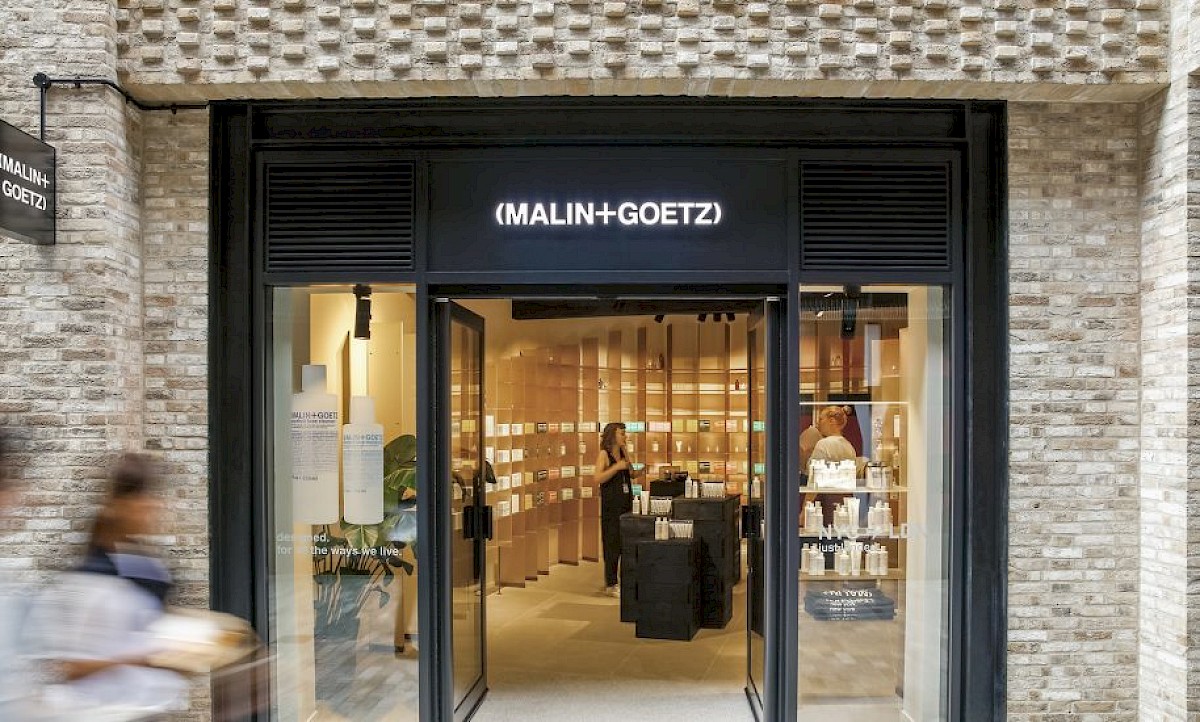
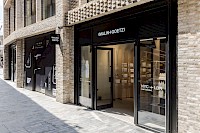
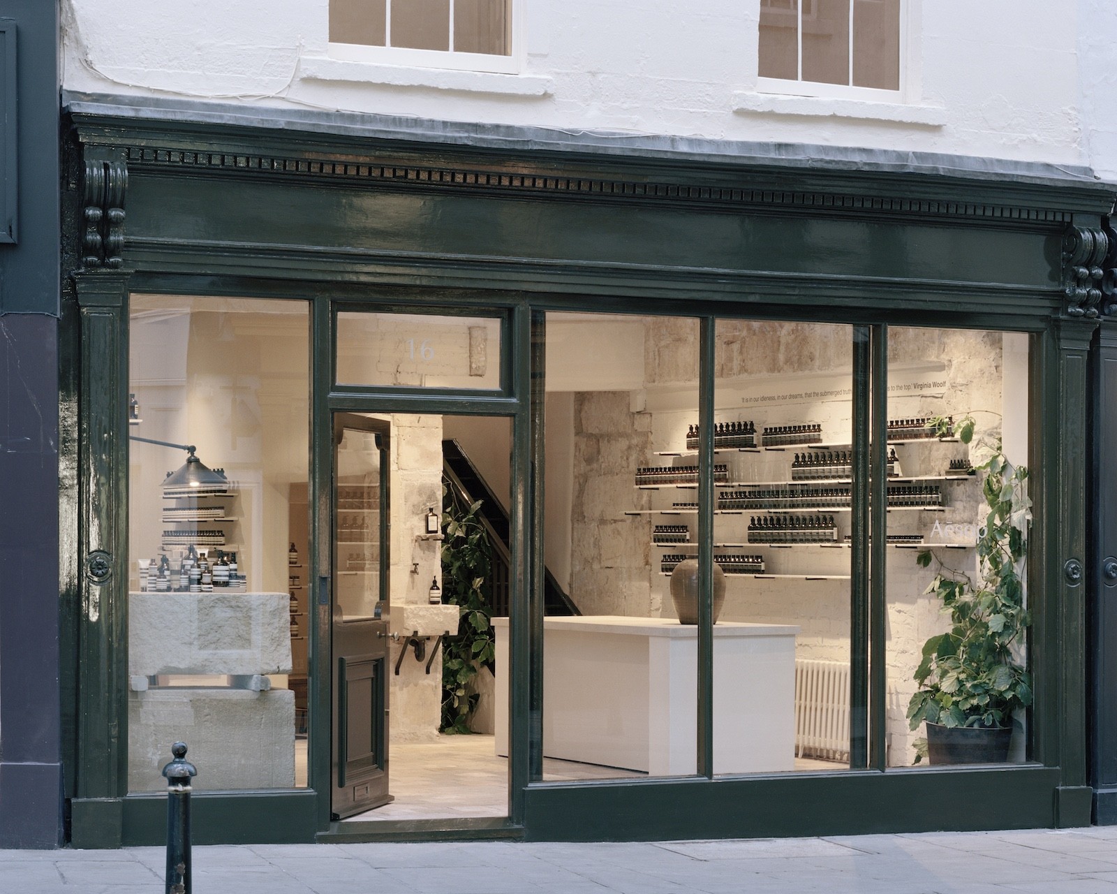
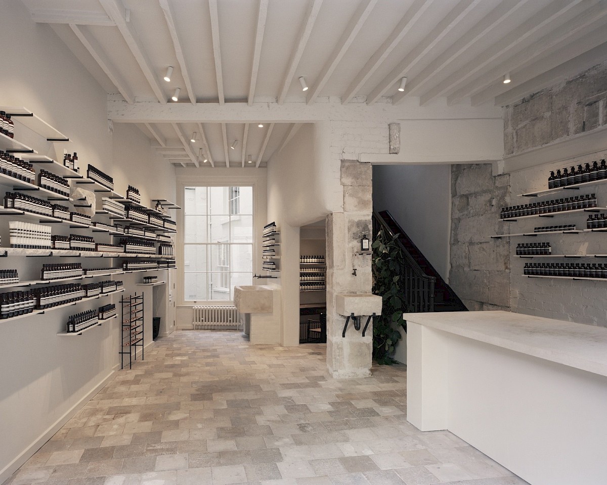
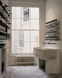
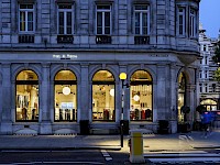
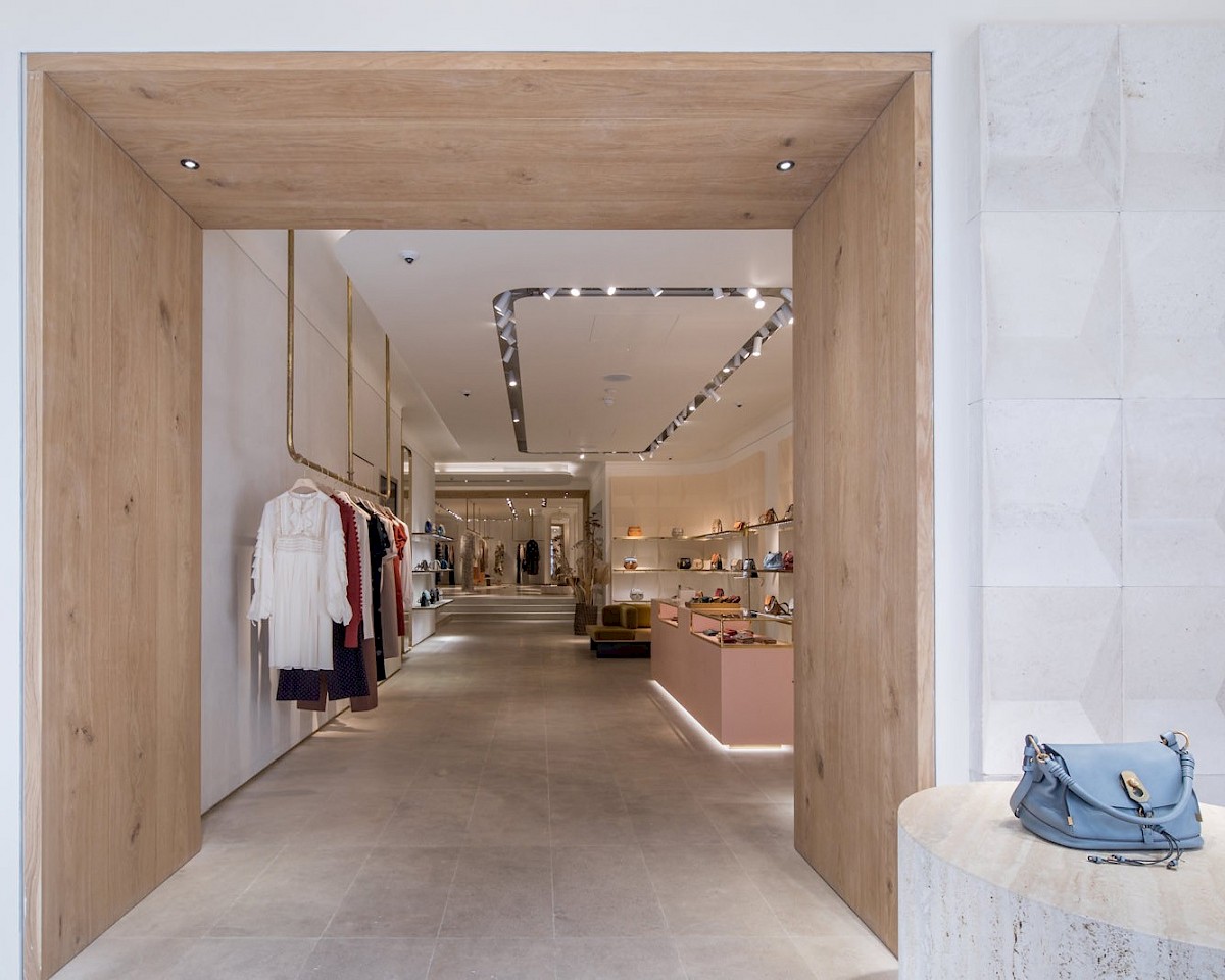
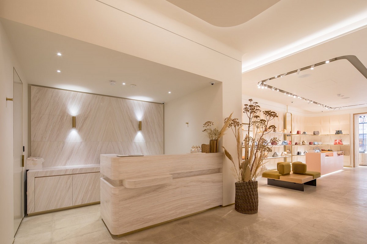
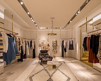
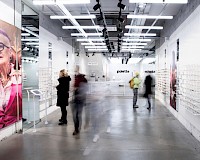
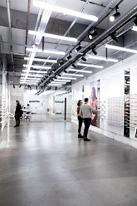
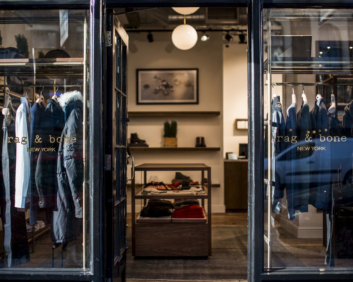
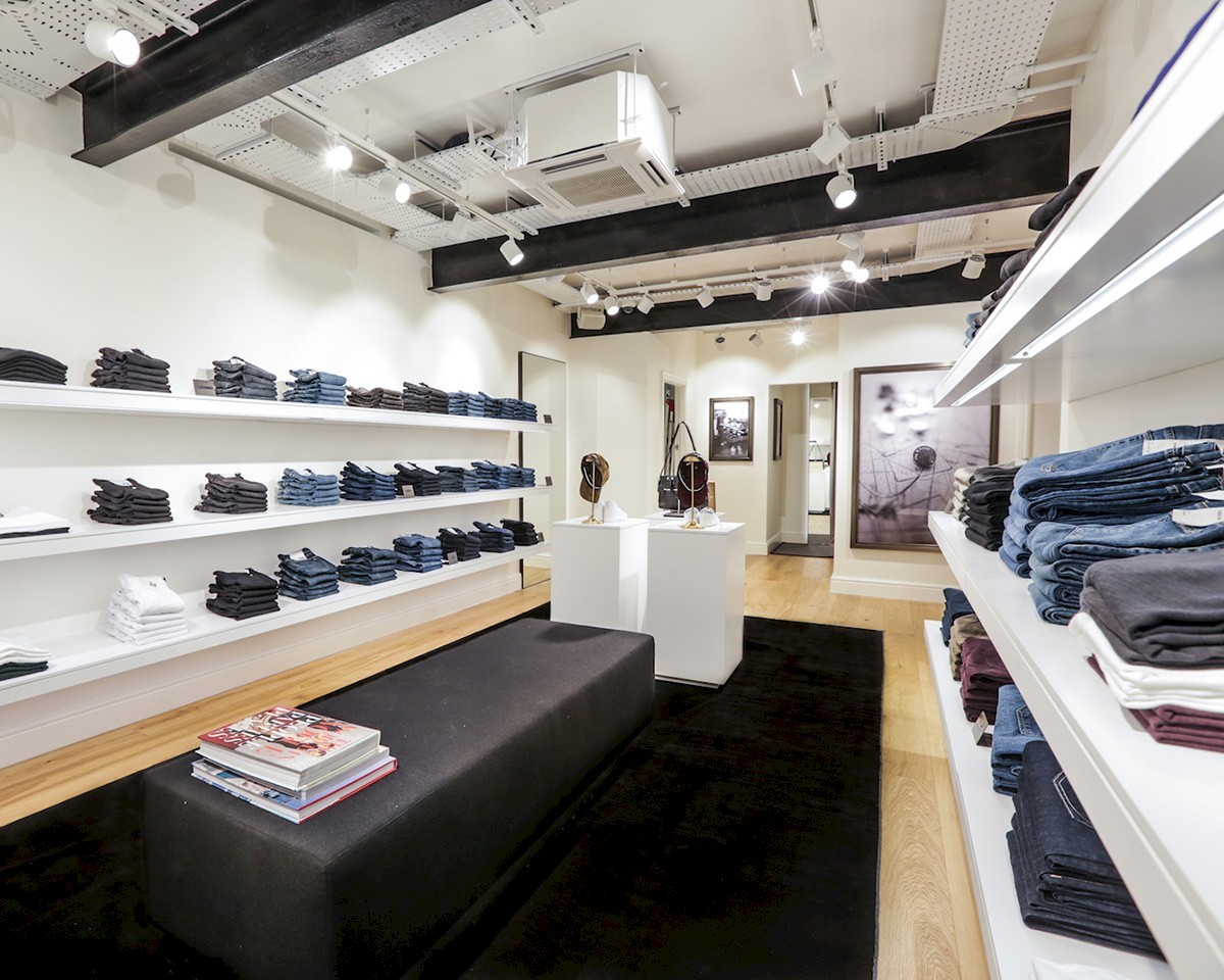
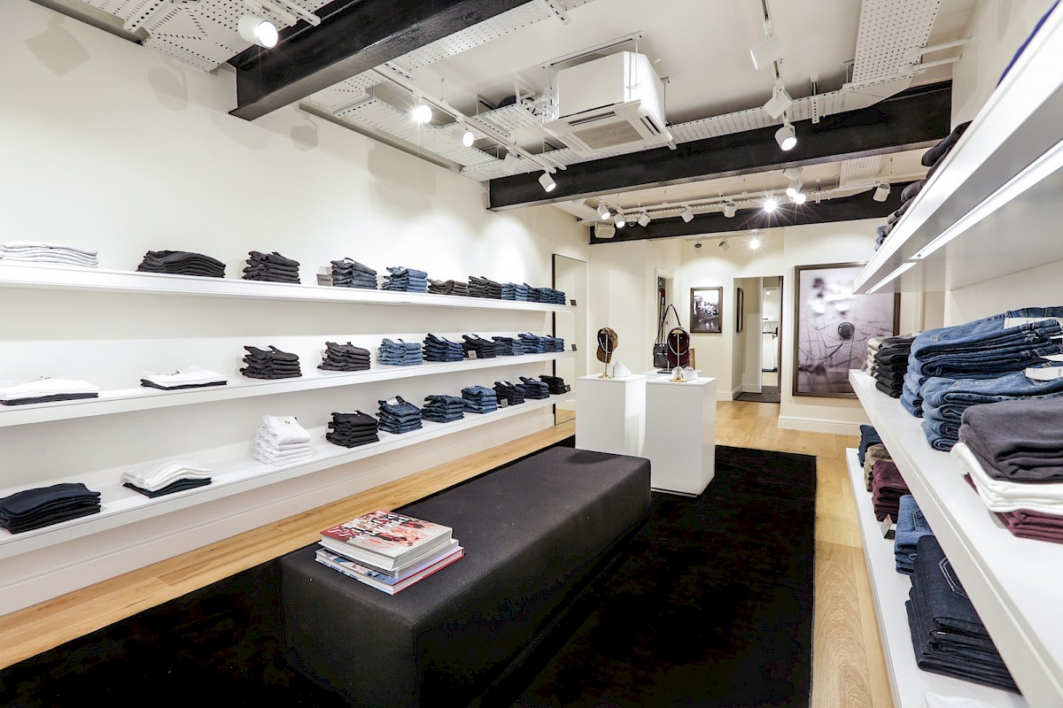
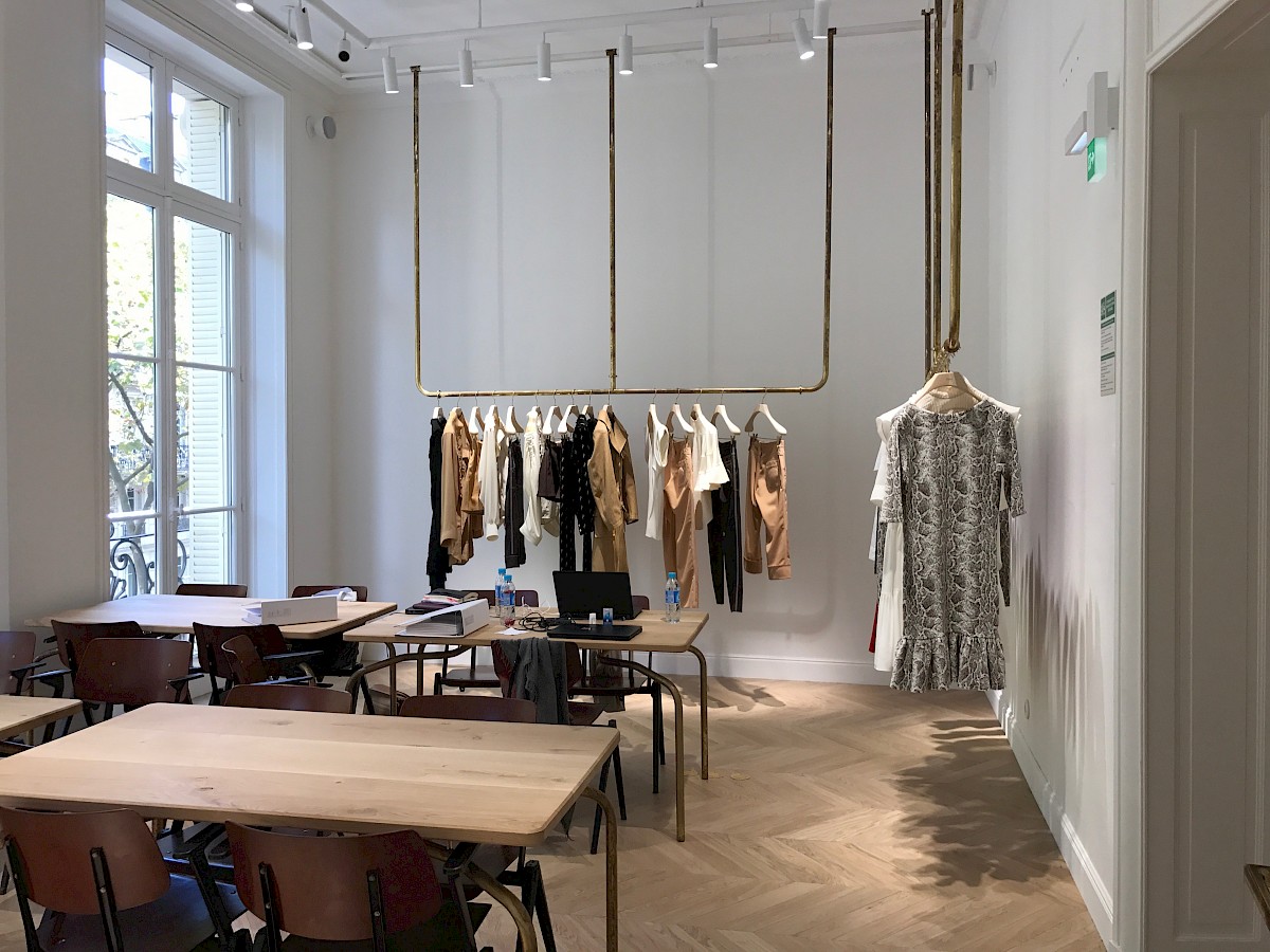
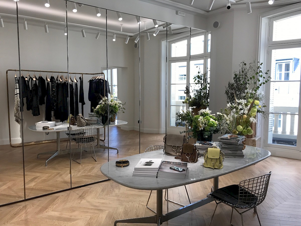
MALIN+GOETZ now expands into Battersea Power Station with the same vision as in 2004 – creating a modern beauty store experience reminiscent of traditional neighborhood apothecaries: brimming with activity, efficacious treatments + exceptional customer experience.
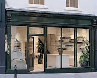
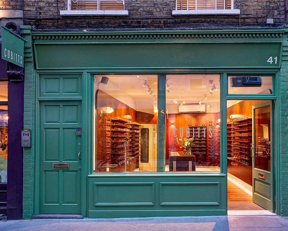
Located in the remarkable building of a decommissioned coal-fired power station, this latest MALIN+GOETZ expansion took visual cues from Turbine Hall A that the space is situated within – both the rich architectural history and the iconic design elements creatively informed the concept of the store.
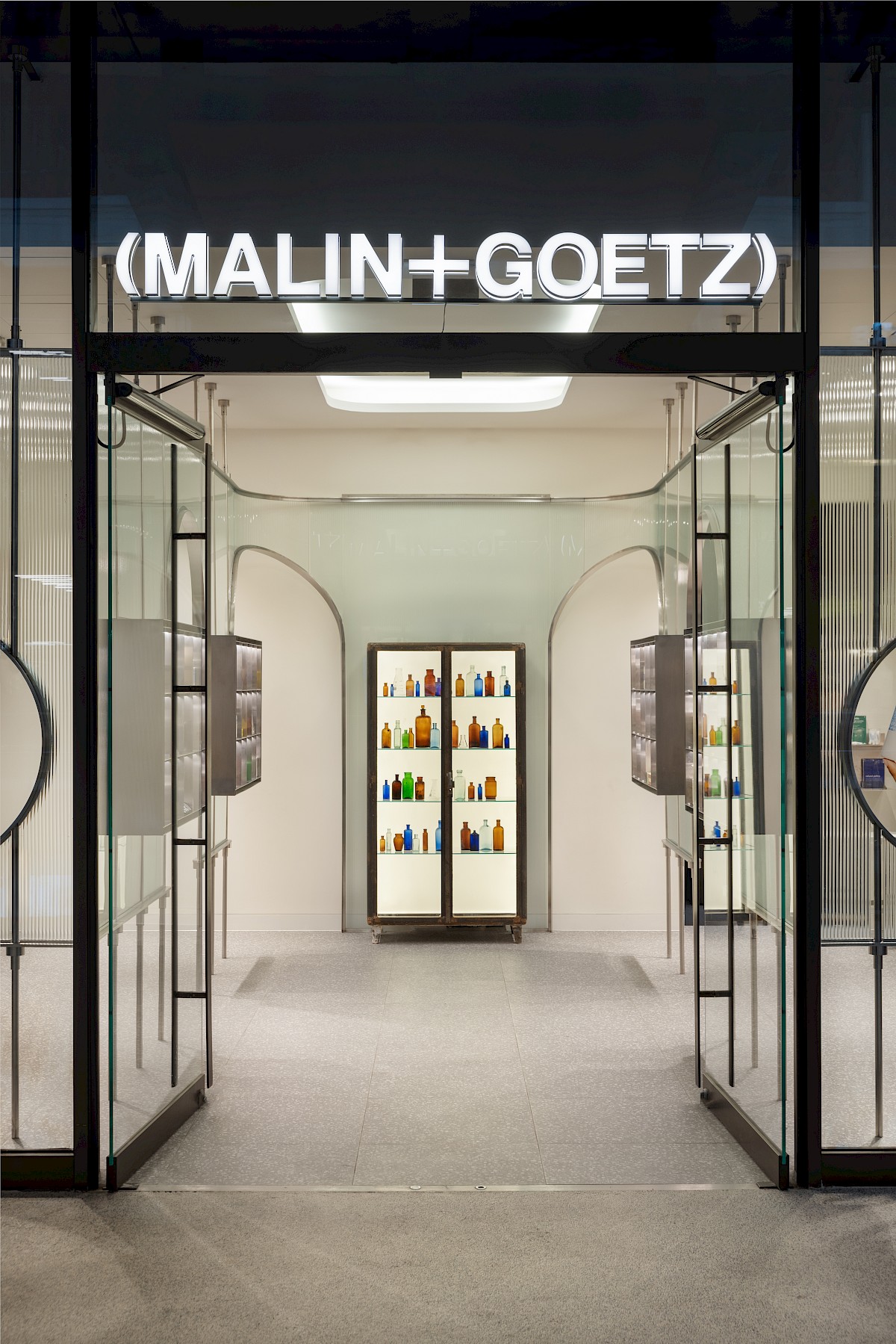
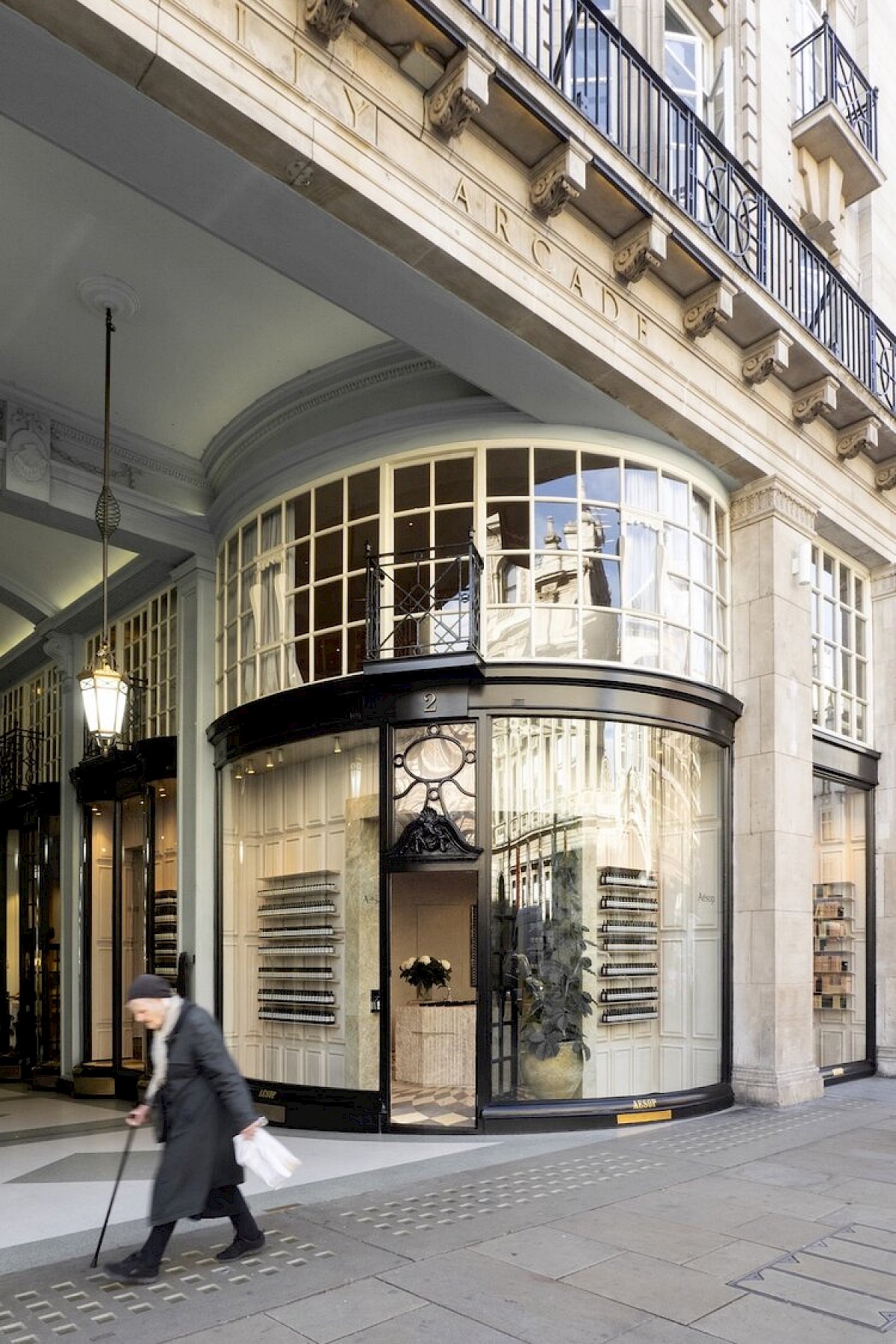
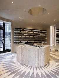
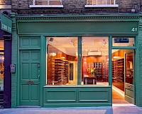
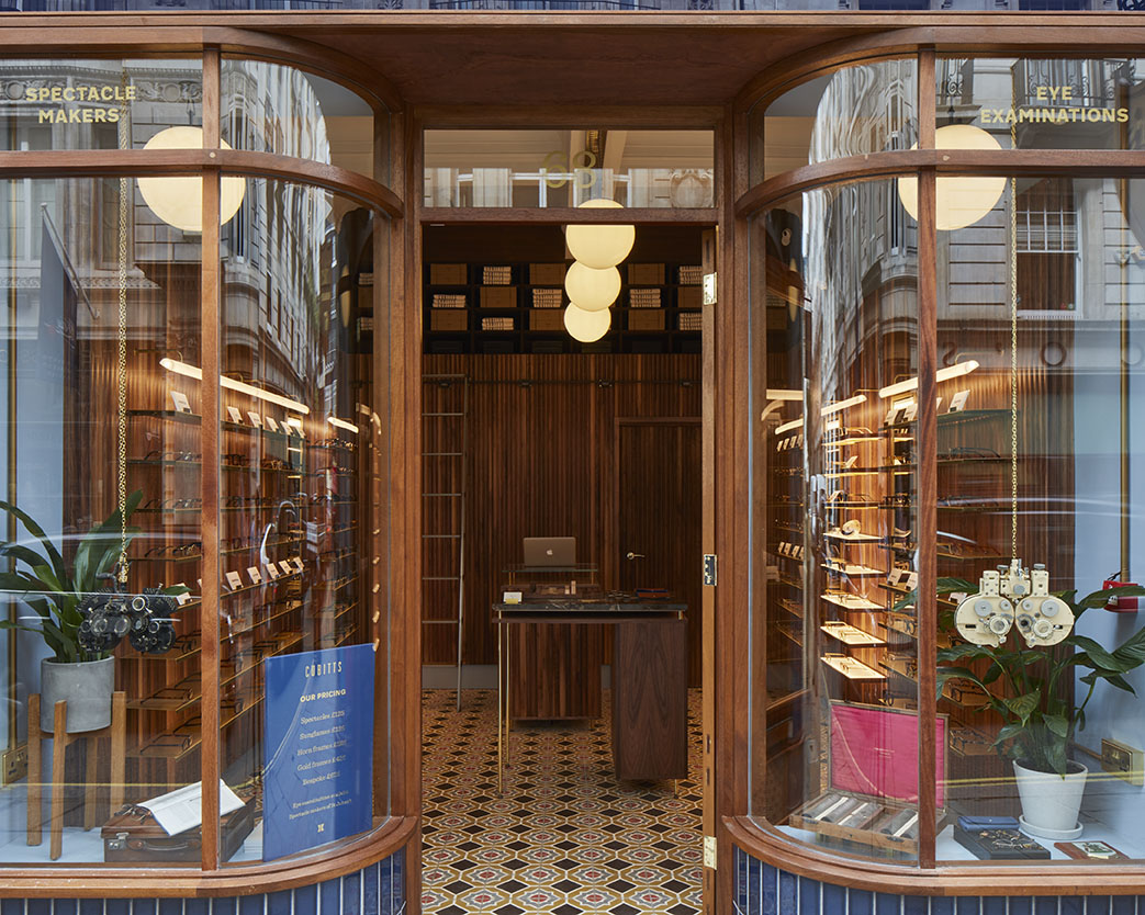
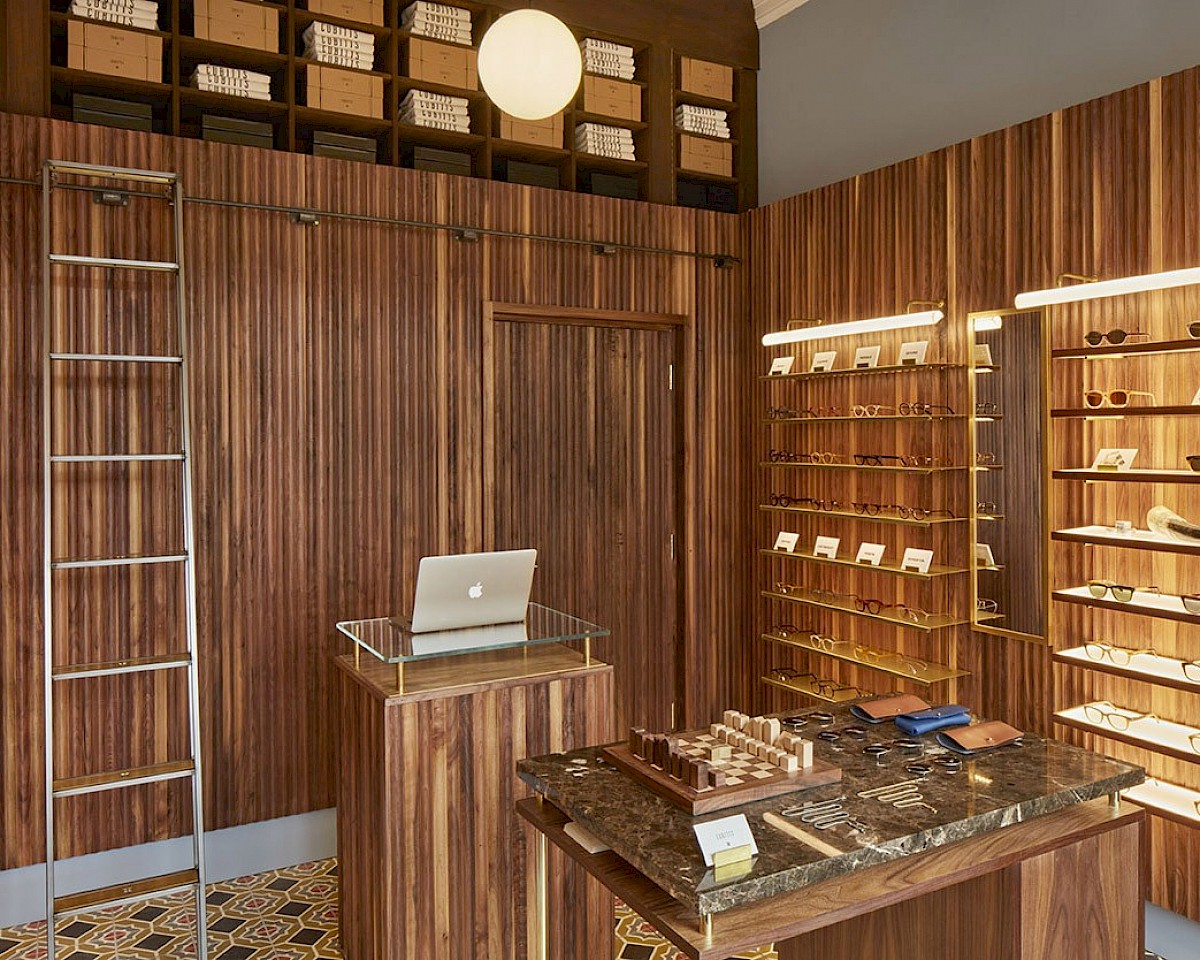
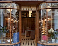
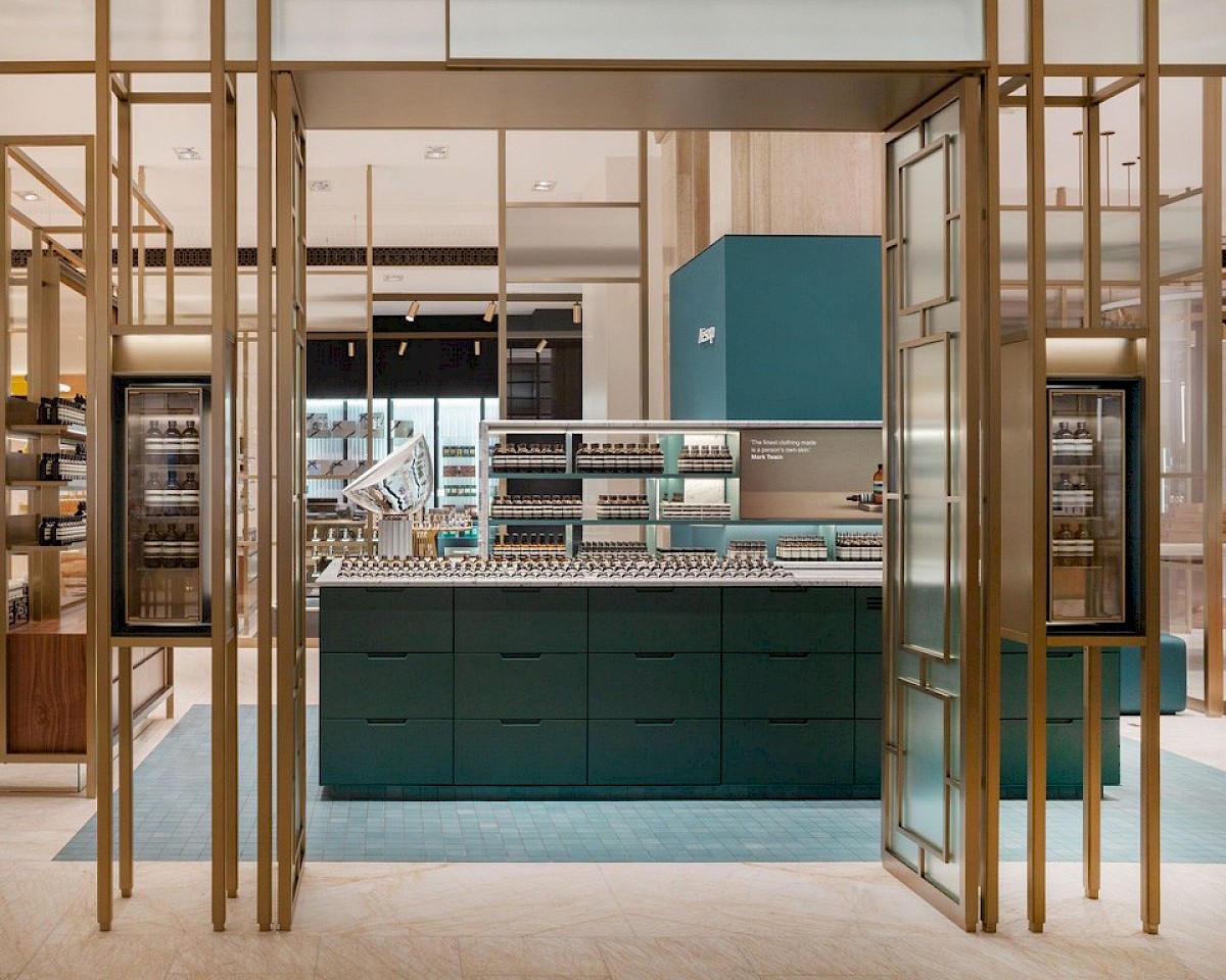
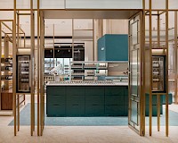
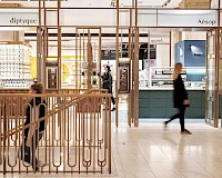
In collaboration with 101 ARCHITECTURE+DESIGN, the apothecary is designed to be in keeping with the luxurious Art Deco intent. The spatial coordination was developed on the basis of using the store front as a central point of symmetry, creating a small but elaborate Art Deco arcade of fluted glass. Simple geometric shapes, adorned with minimal ornamentation, reminiscent of an industrial era of glamour.
Strong architectural influence was taken from the rich historical context the boutique sits in - Turbine Hall A, completed in 1935 by Sir Gilbert Scott, boasts a strong Art Deco theme; in which Control Room A is housed -
Halliay’s Art Deco interiors boasted Italian marble, polished parquet floors and wrought-iron staircases, walls lined with grey ‘ribbon napoleon’ and black Belgian marble, wrought iron staircases, walnut veneer furniture, holophane light fittings and a heavily decorative bronzed door.
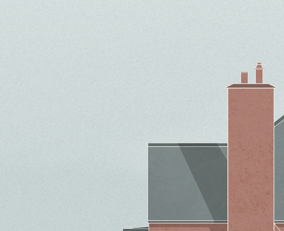
He additionally designed a deliberately sparse and simplistic facade, complemented intermittently with bold flourishes and narrow vertical windows and pilasters, dubbed the ‘Jazz Modern’ effect. The defining motif remains to be the chimneys, each built on stepped pedestals to emulate fluted doric columns, inspired by romanesque and classical architecture.
Upon its completion in 1935, despite the constant backlash throughout it’s construction (resulting in the appointment of Sir Gilbert Scott nearing the final stages of the project, to appease critics), the press upon opening had dubbed the Power Station as a ‘Cathedral of Electricity’ and even so far as ‘Temple of Power’ - relaying the sheer monolithic presence the structure had, paired with the vision of Pearce, Halliday and Sir Gilbert Scott.
WilkinsonEyre’s 30 year journey to fully restore the old powerhouse was an extremely faithful one - so far as to using recent technological advancements (previously invented for events such as the F1), to perfectly emulate the paint on the dials of Control Room A, where possible conserving what could be preserved, and where introducing new elements, staying truthful to the original ‘Jazz Modern’ concept.
First taking visual cues from the Turbine Hall A that the space is situated within — both the rich architectural history and the iconic design elements creatively informed our concept.
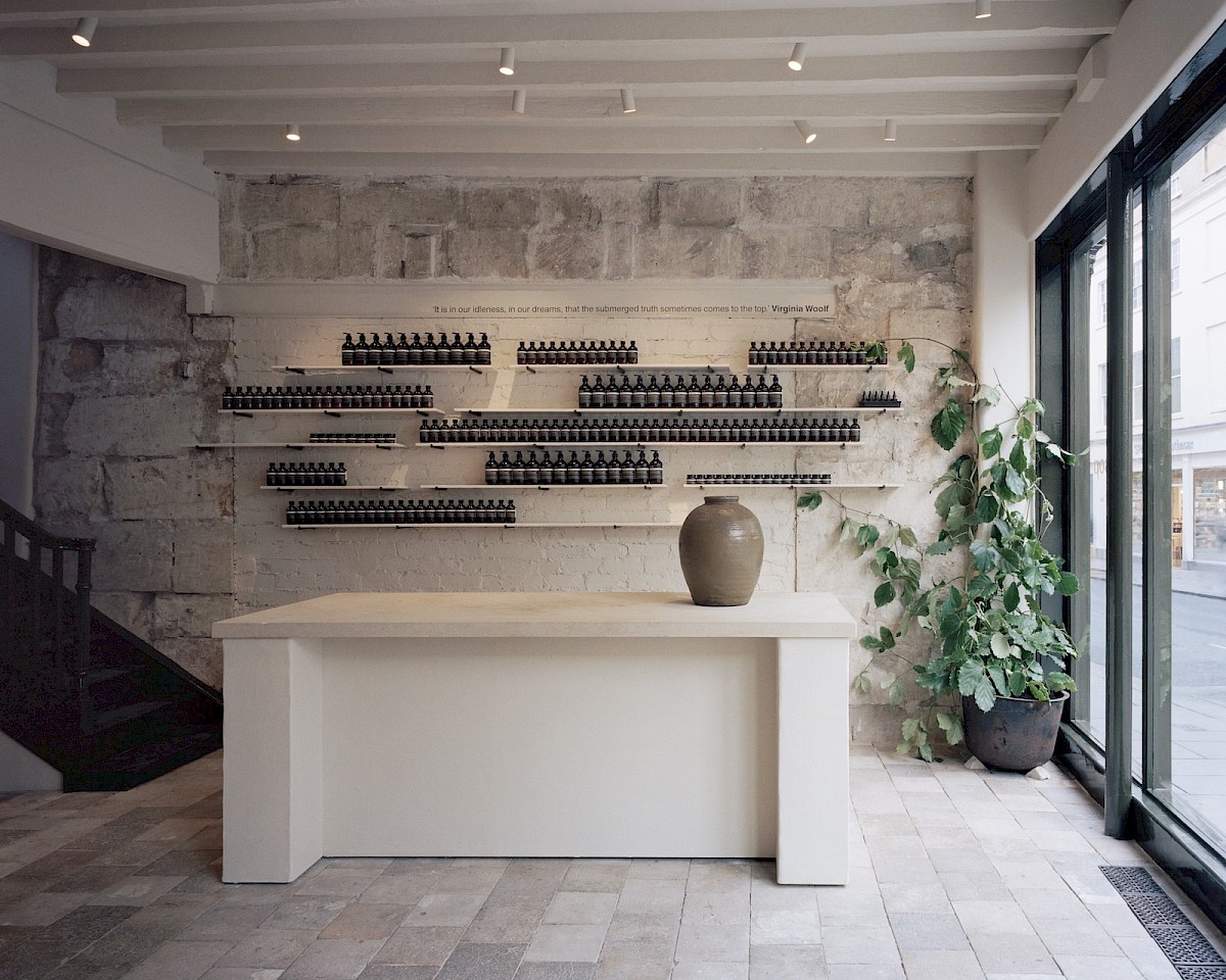
Turbine Hall A features Halliday’s towering Art Deco classically influenced pilasters, their monumental scale denoting the ‘Temple of Power’ of the press release on its initial grand opening. The resultant imperial promenade has a clear, classical rhythm, and symmetry. The retention of it’s historic materials, too, we felt was something to carry over into our concept, the Italian marble, visibly scarred from the historic explosion in the 70s, and the rigid, but decorative ironmongery throughout designed to be in keeping with the original wrought-iron, luxurious Art Deco intent.
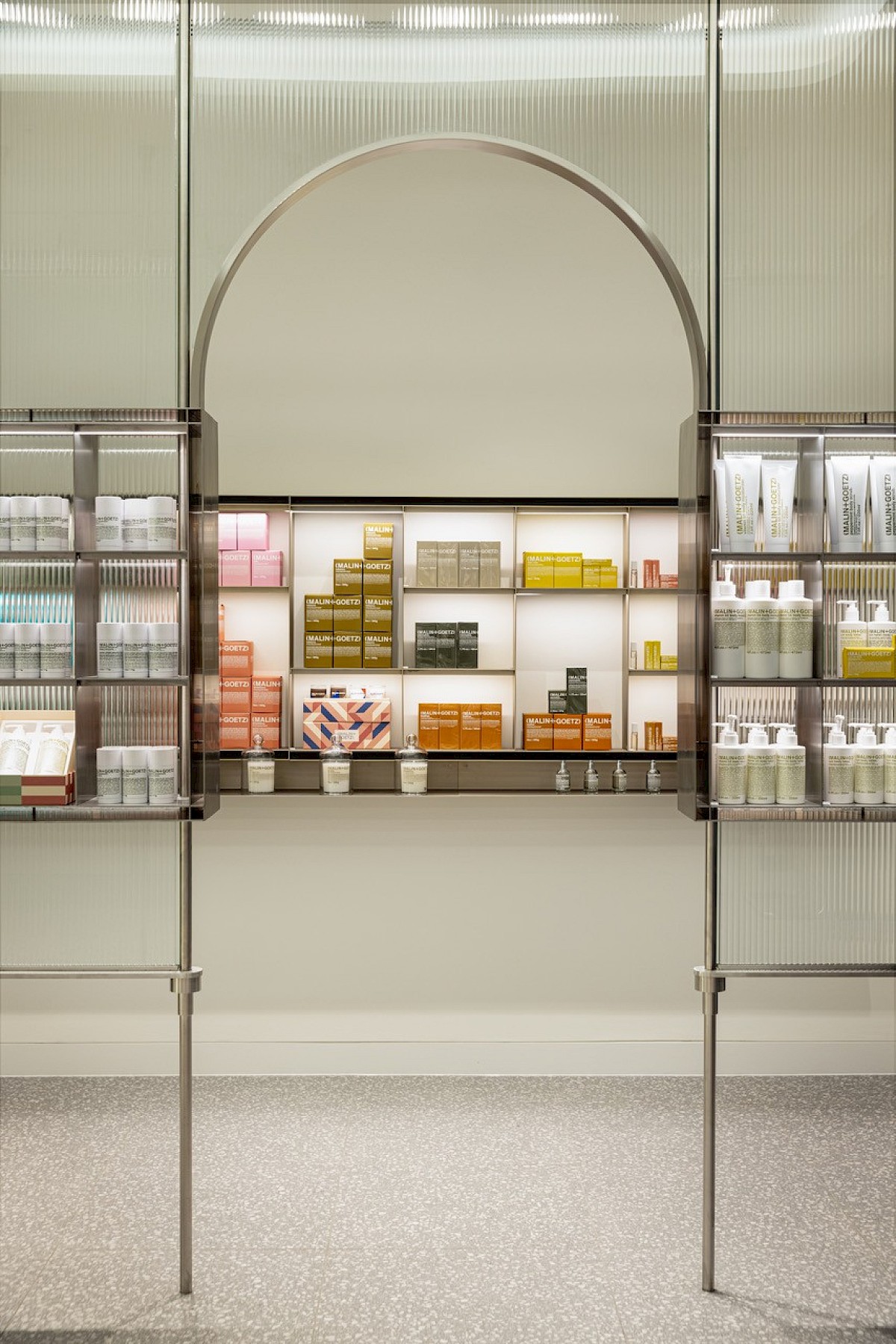
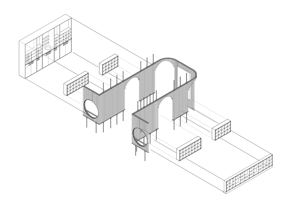
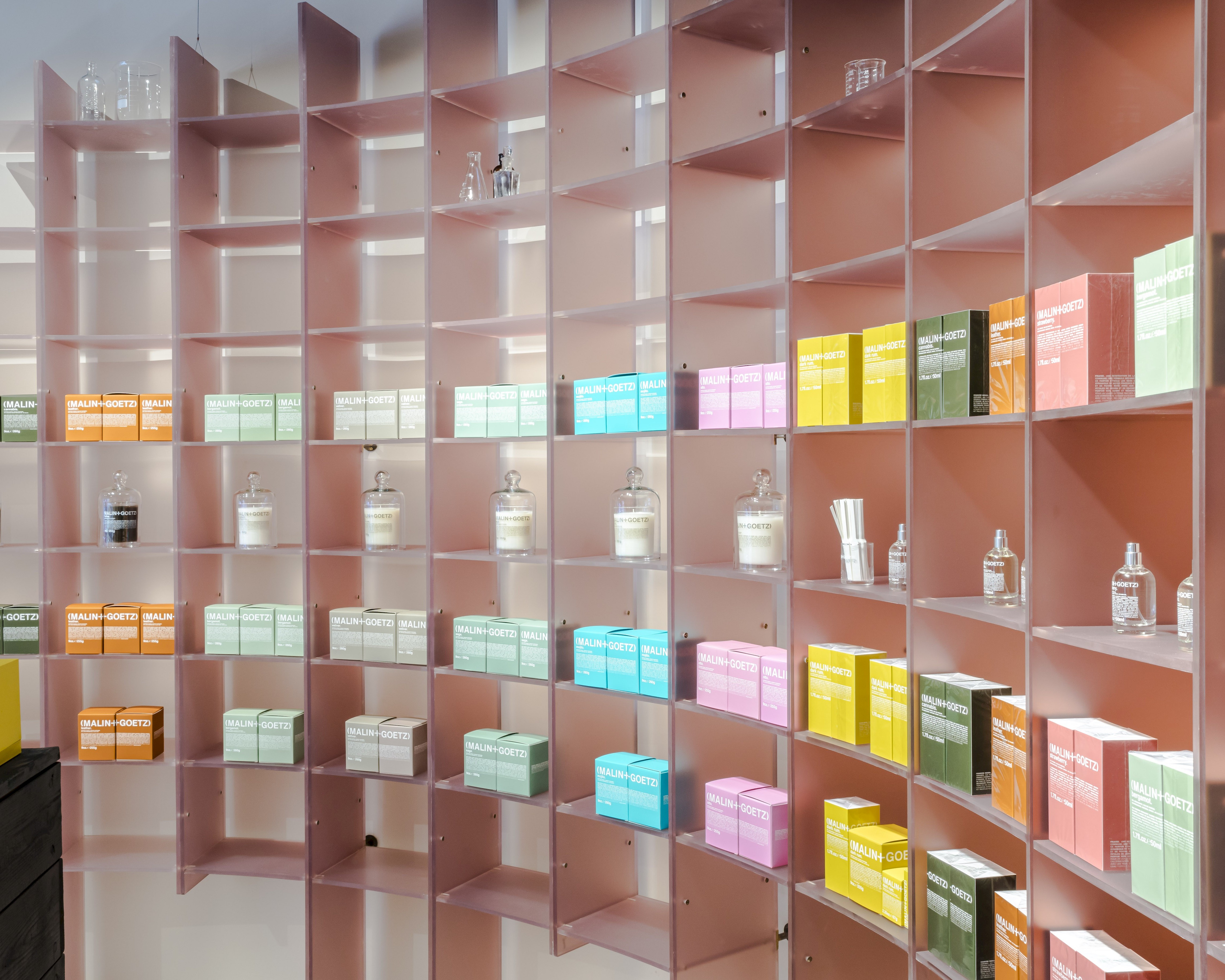
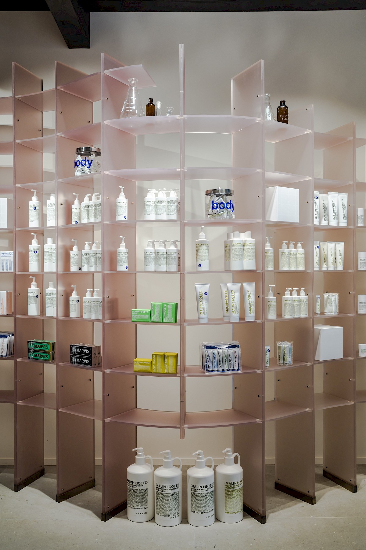
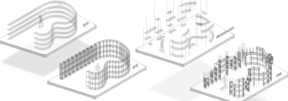
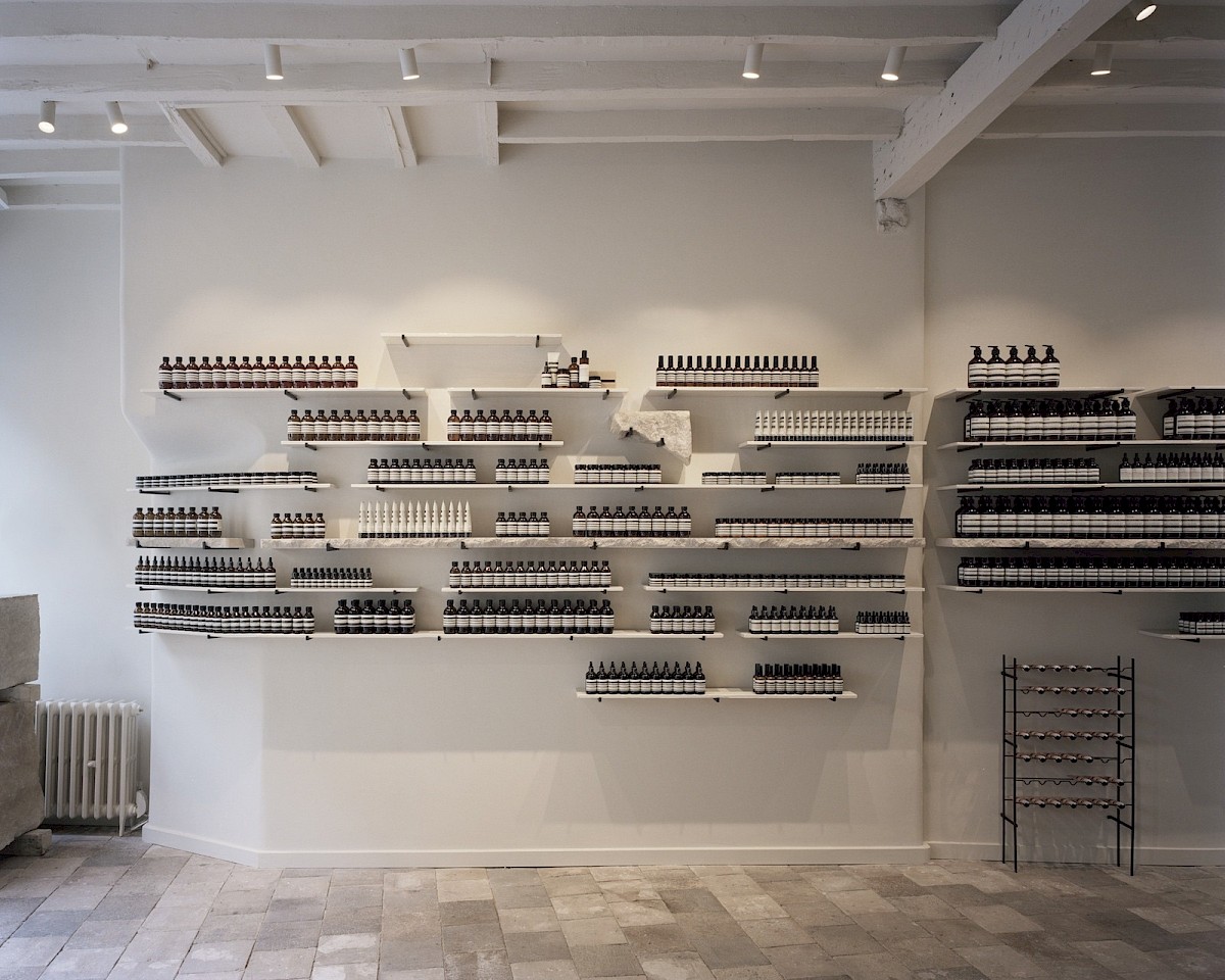
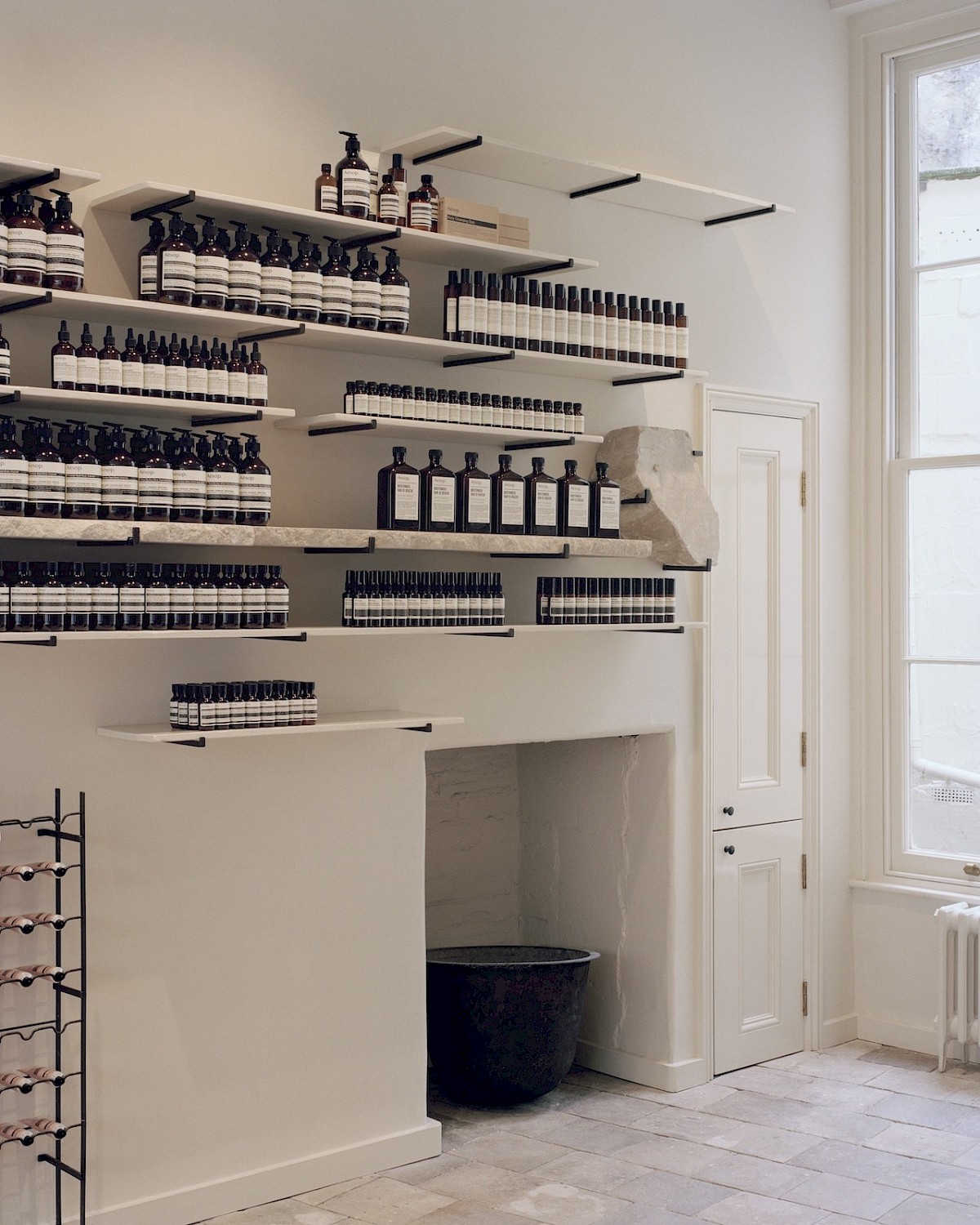
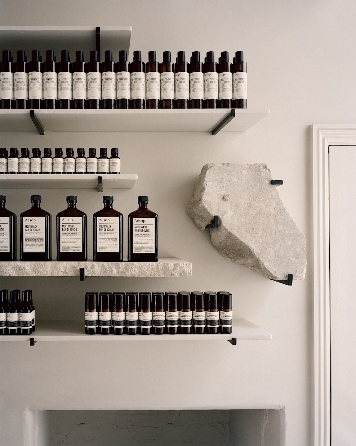
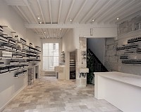
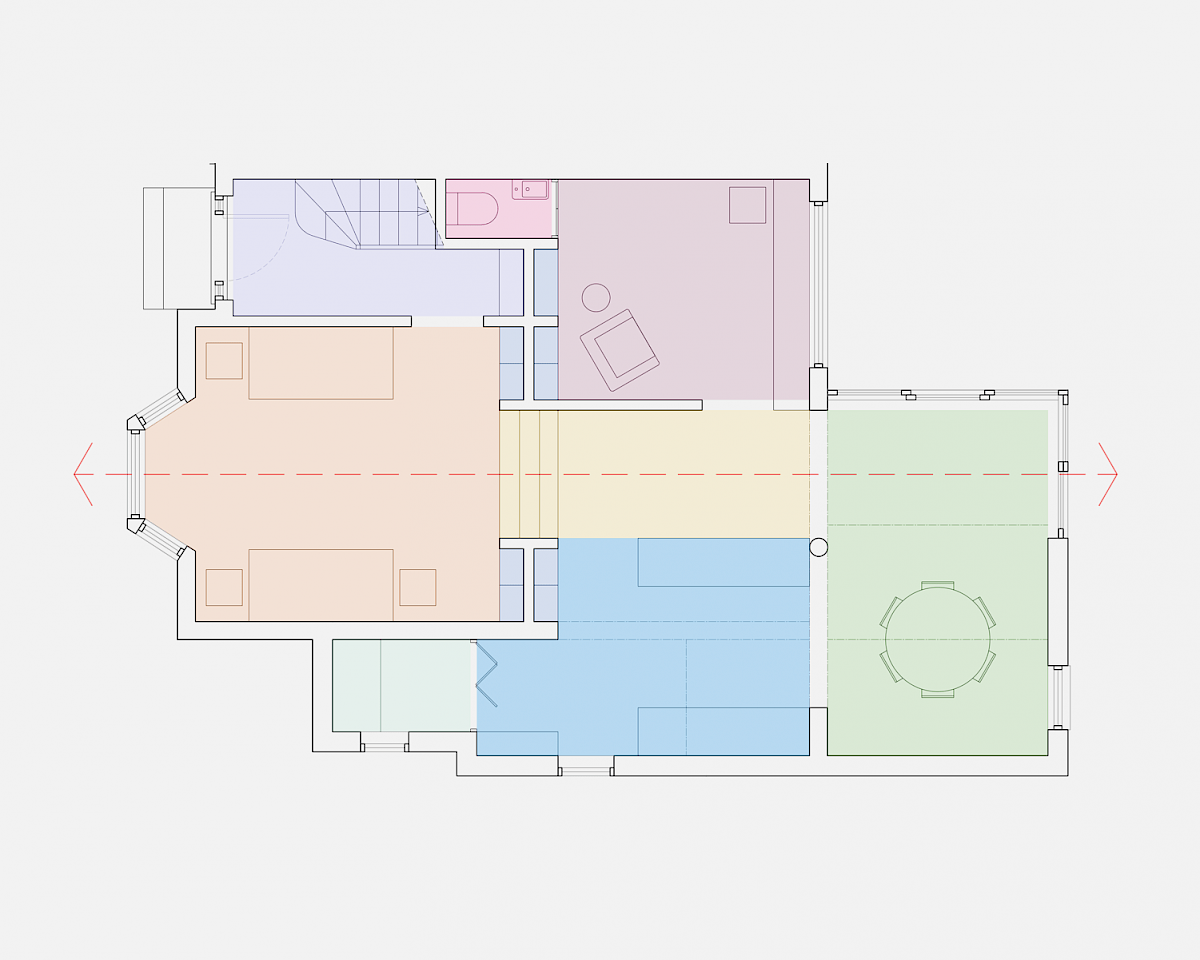
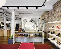
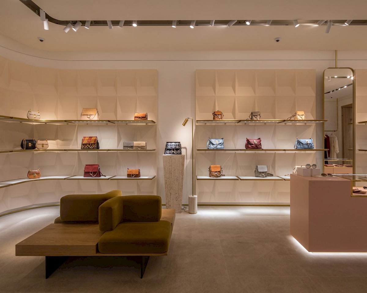
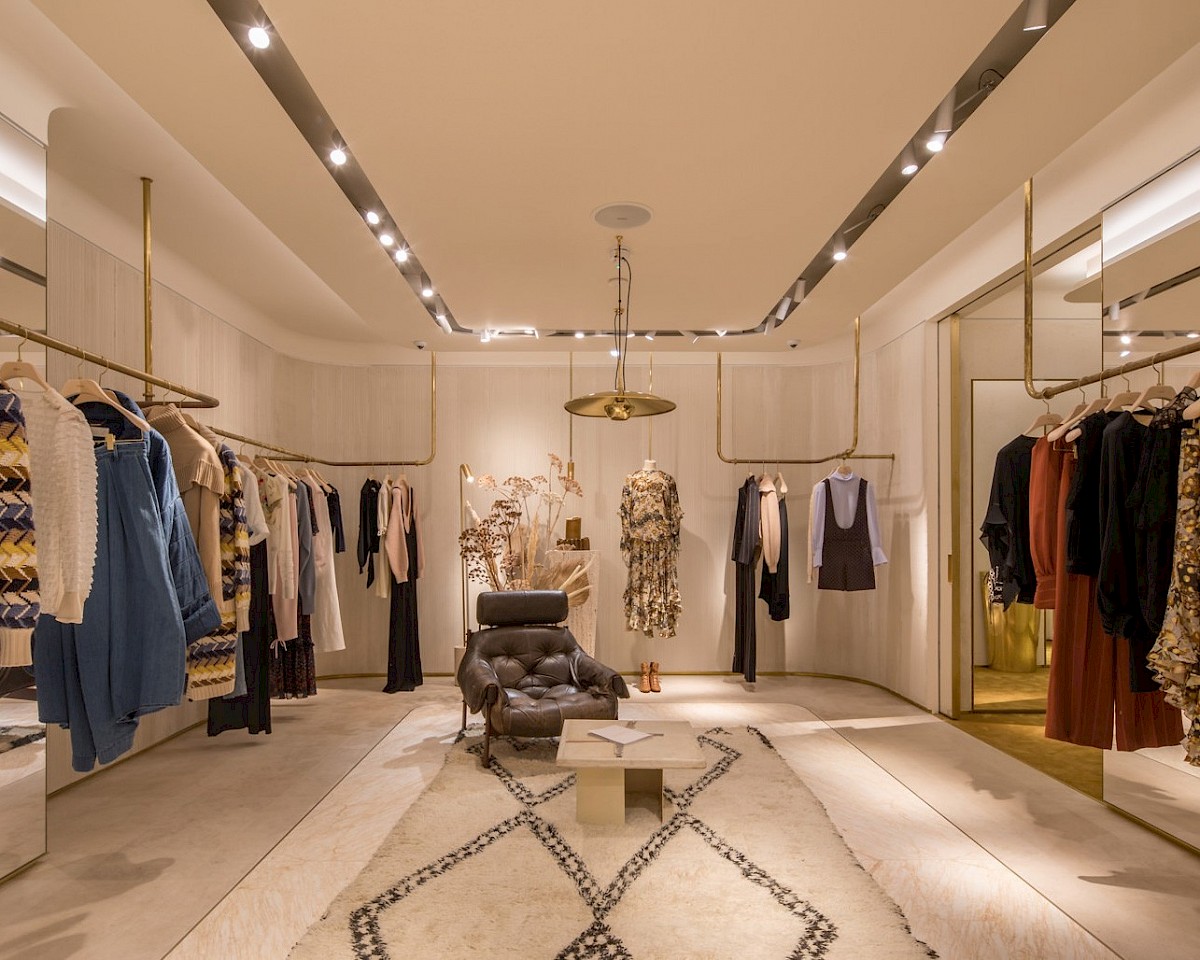
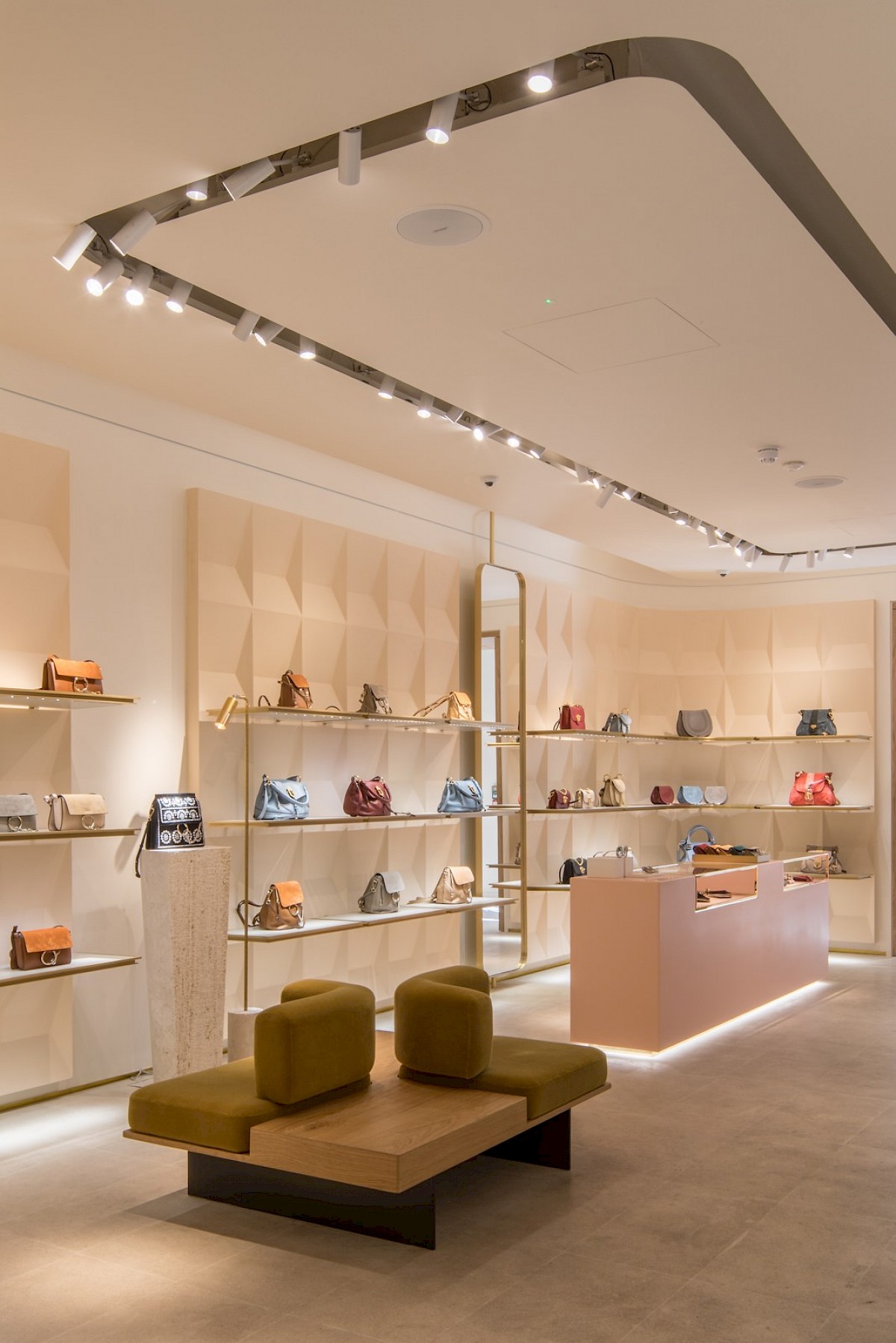
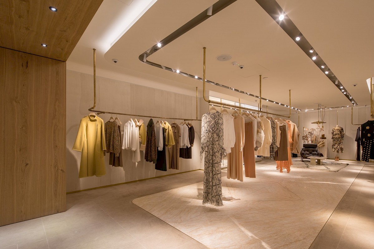
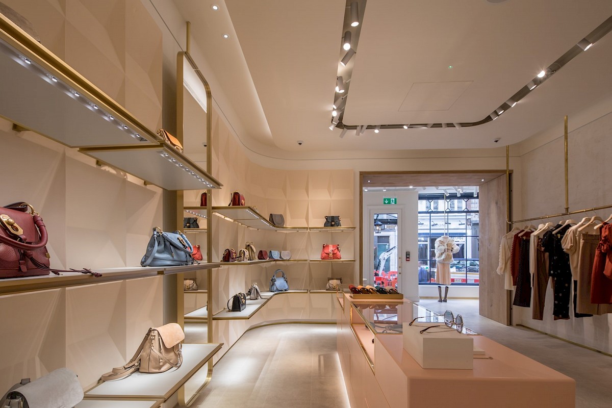
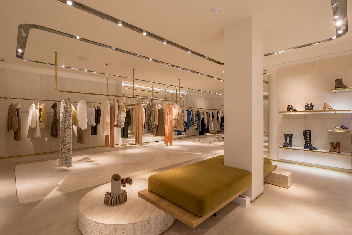
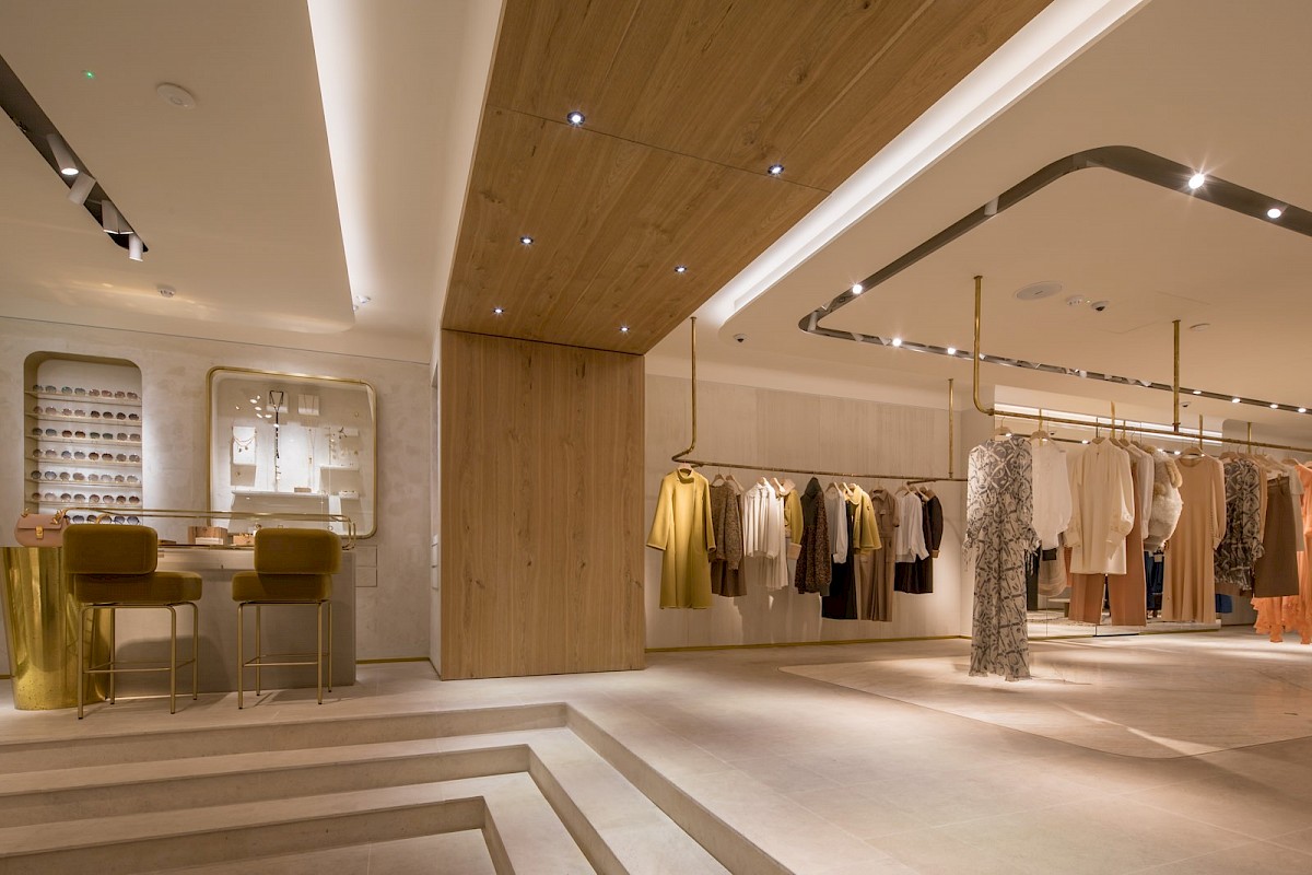
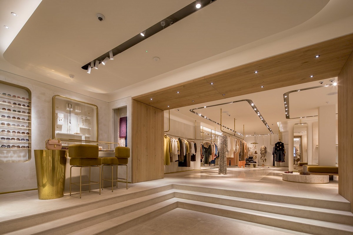
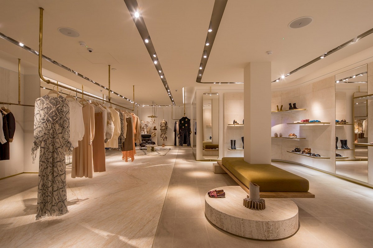
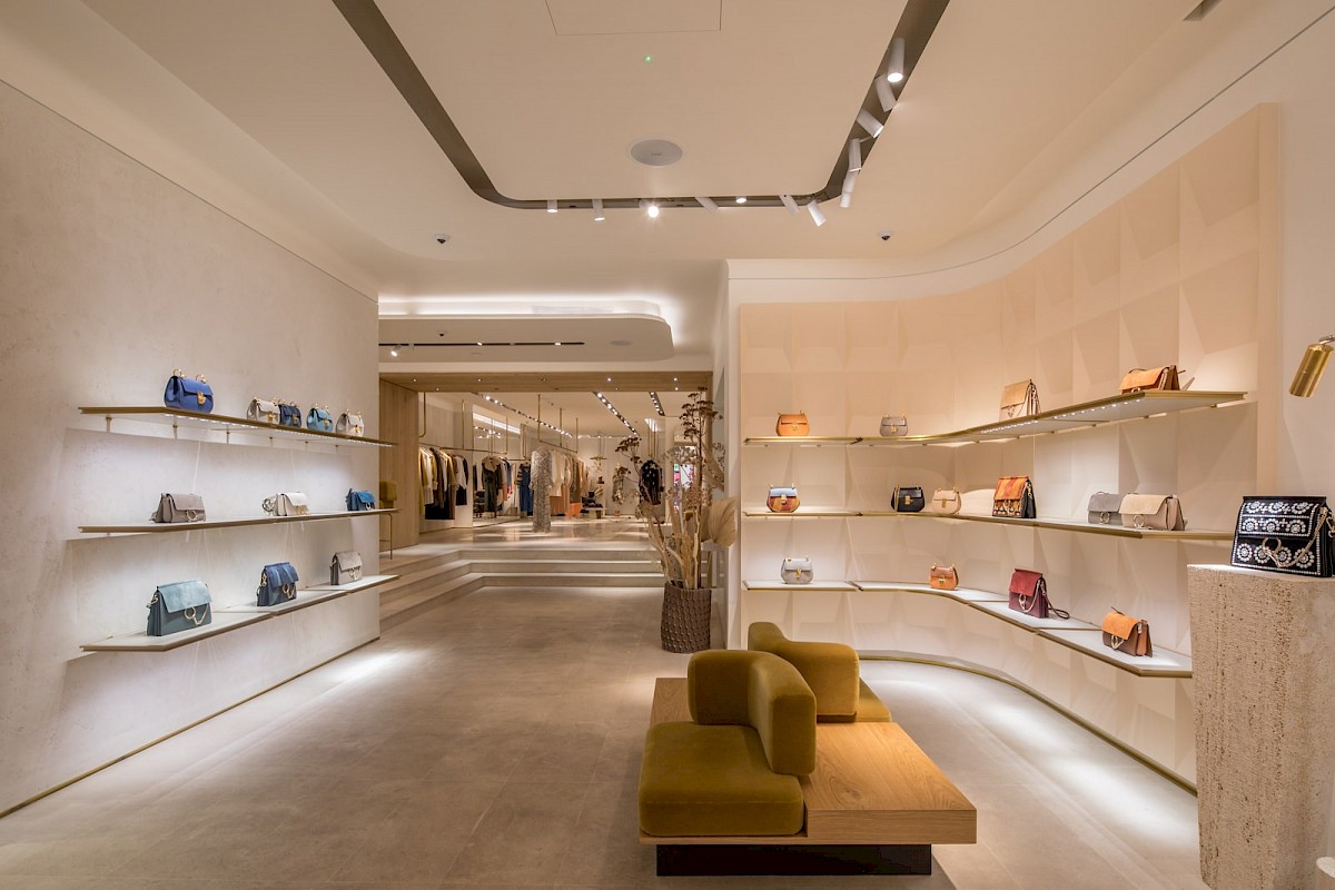
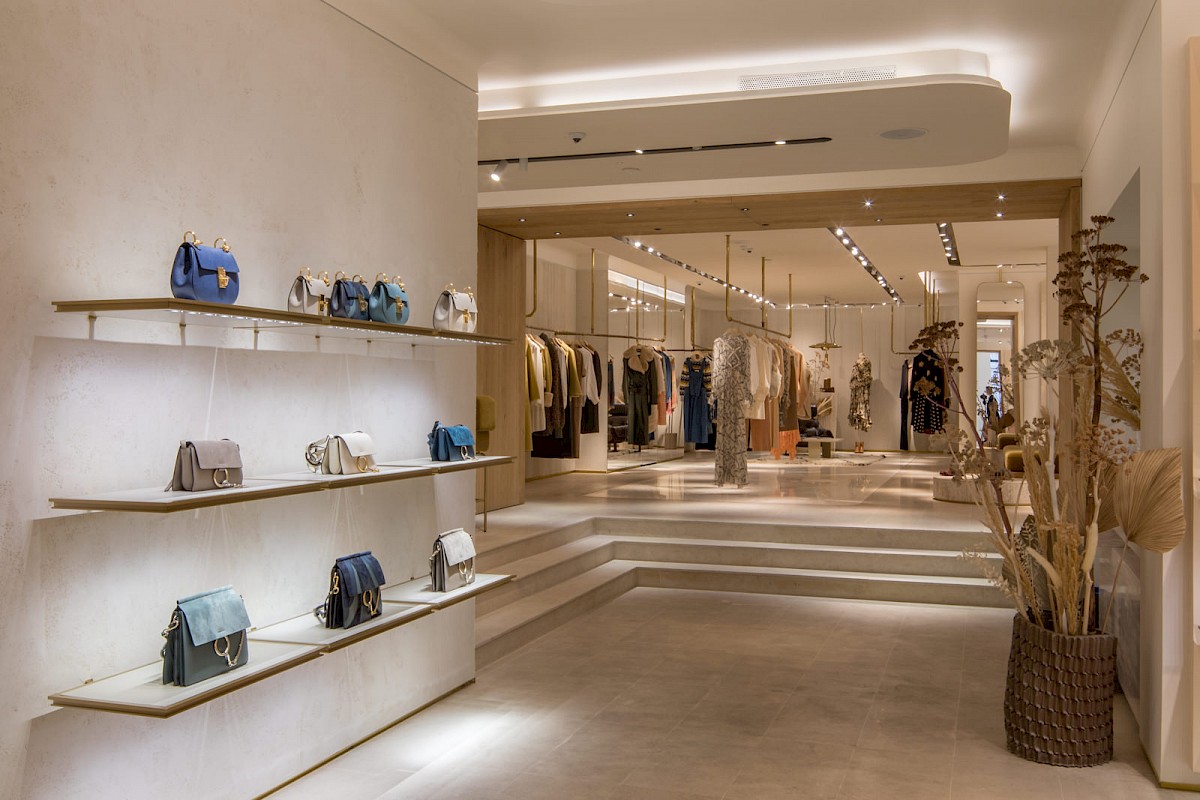
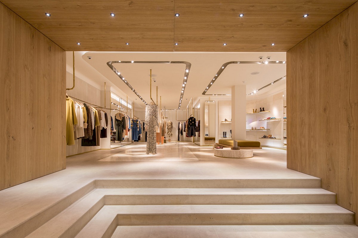
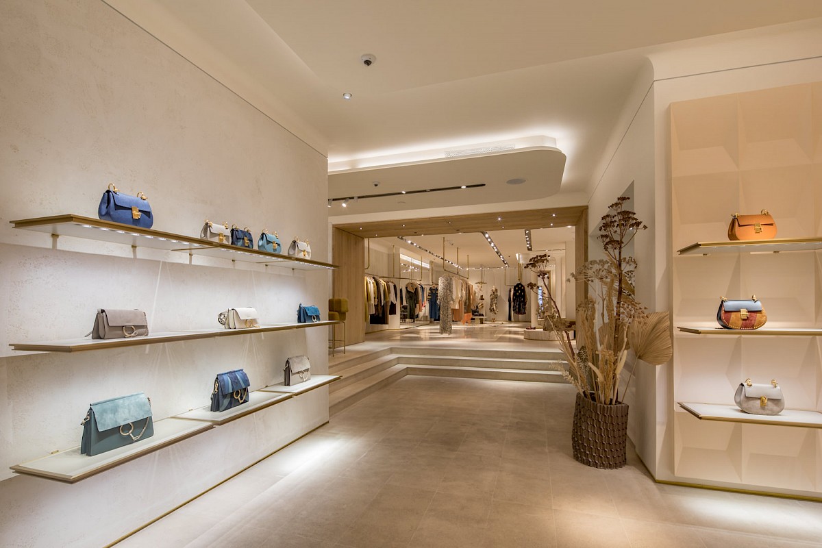
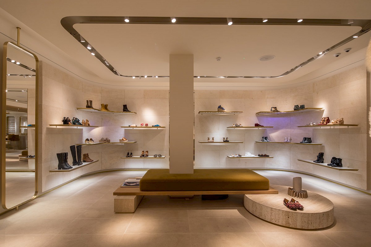
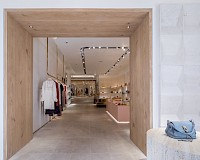
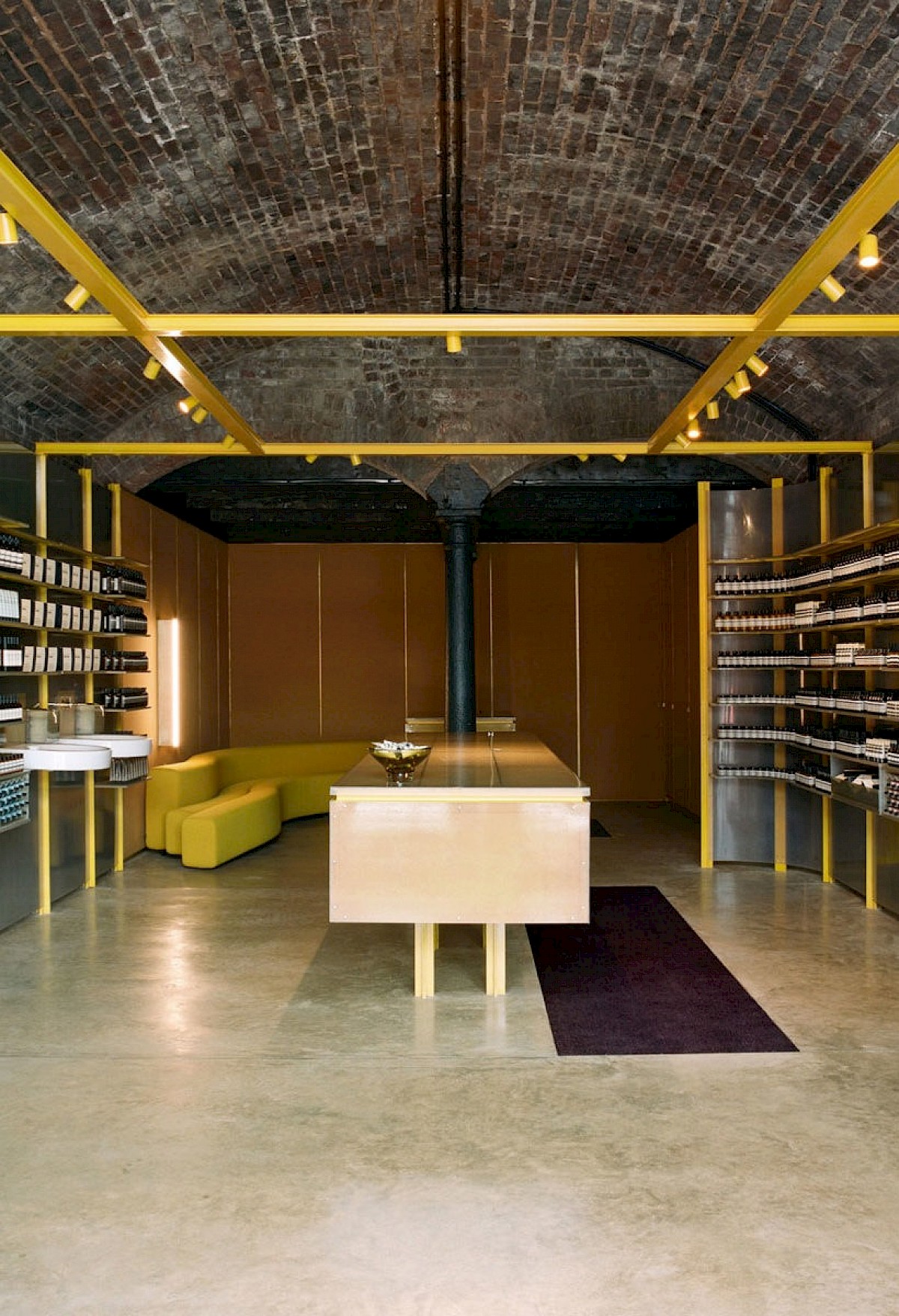
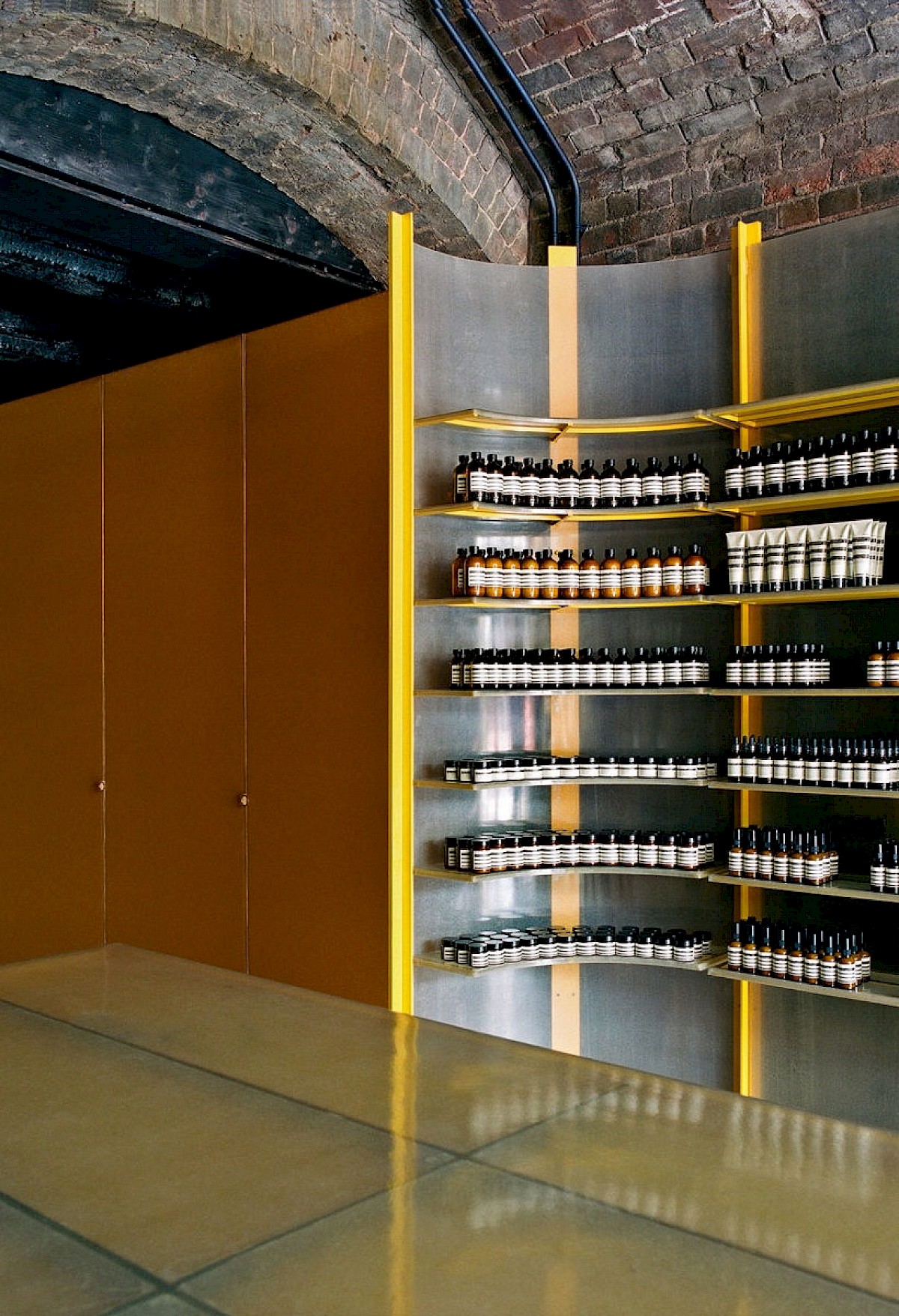
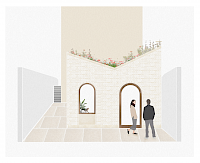
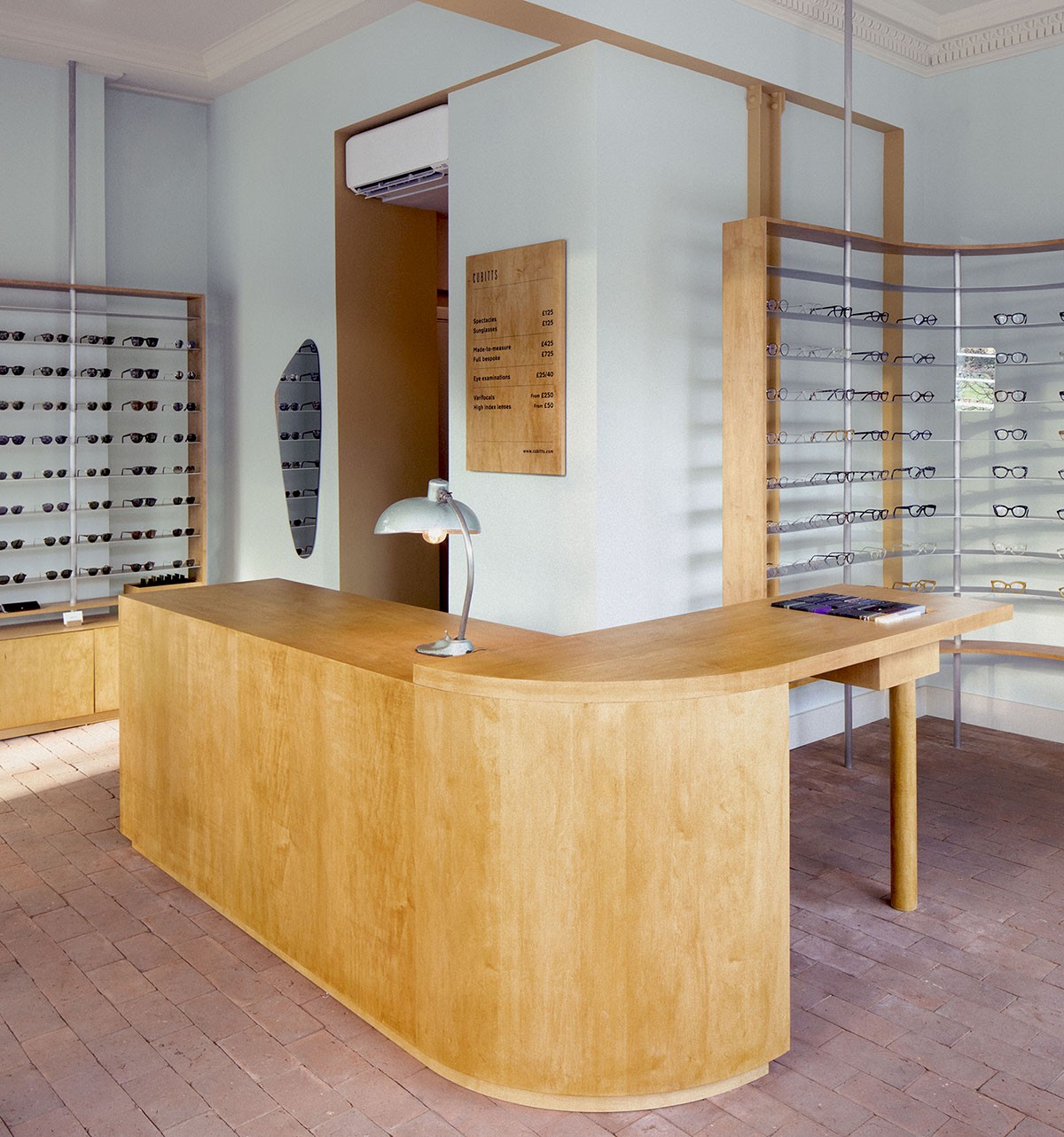
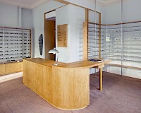
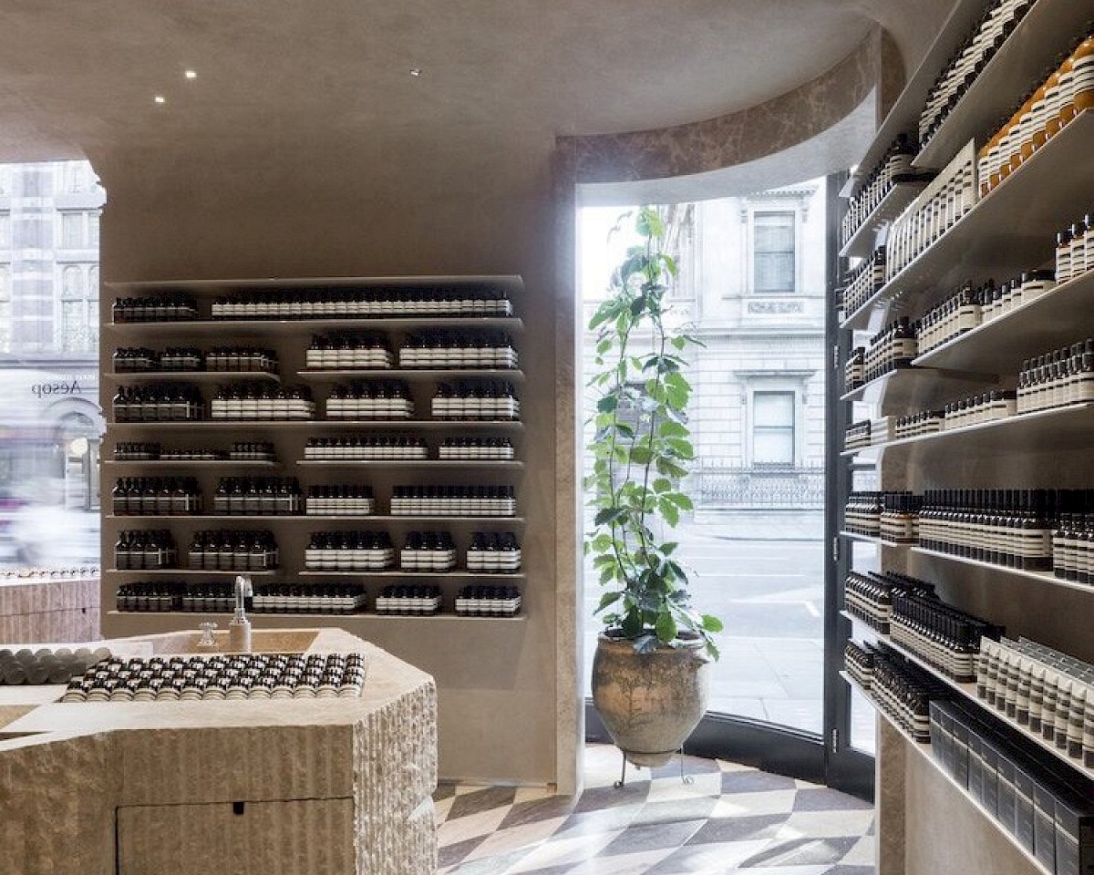
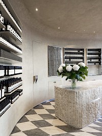
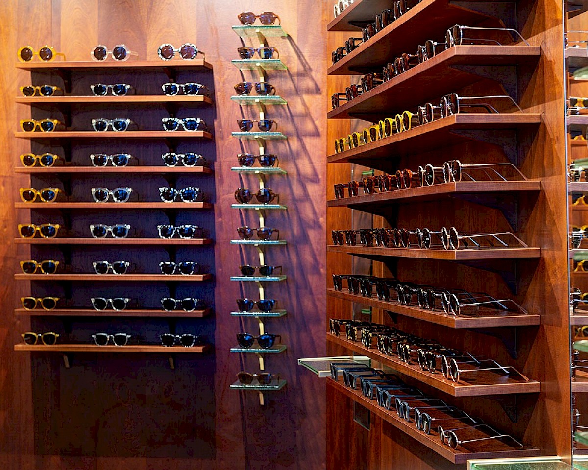
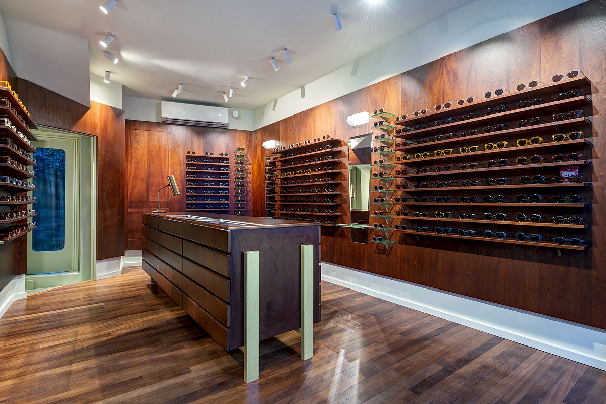
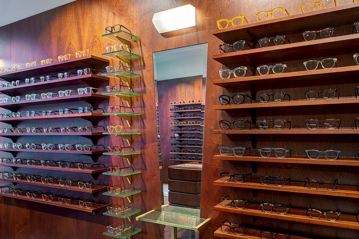
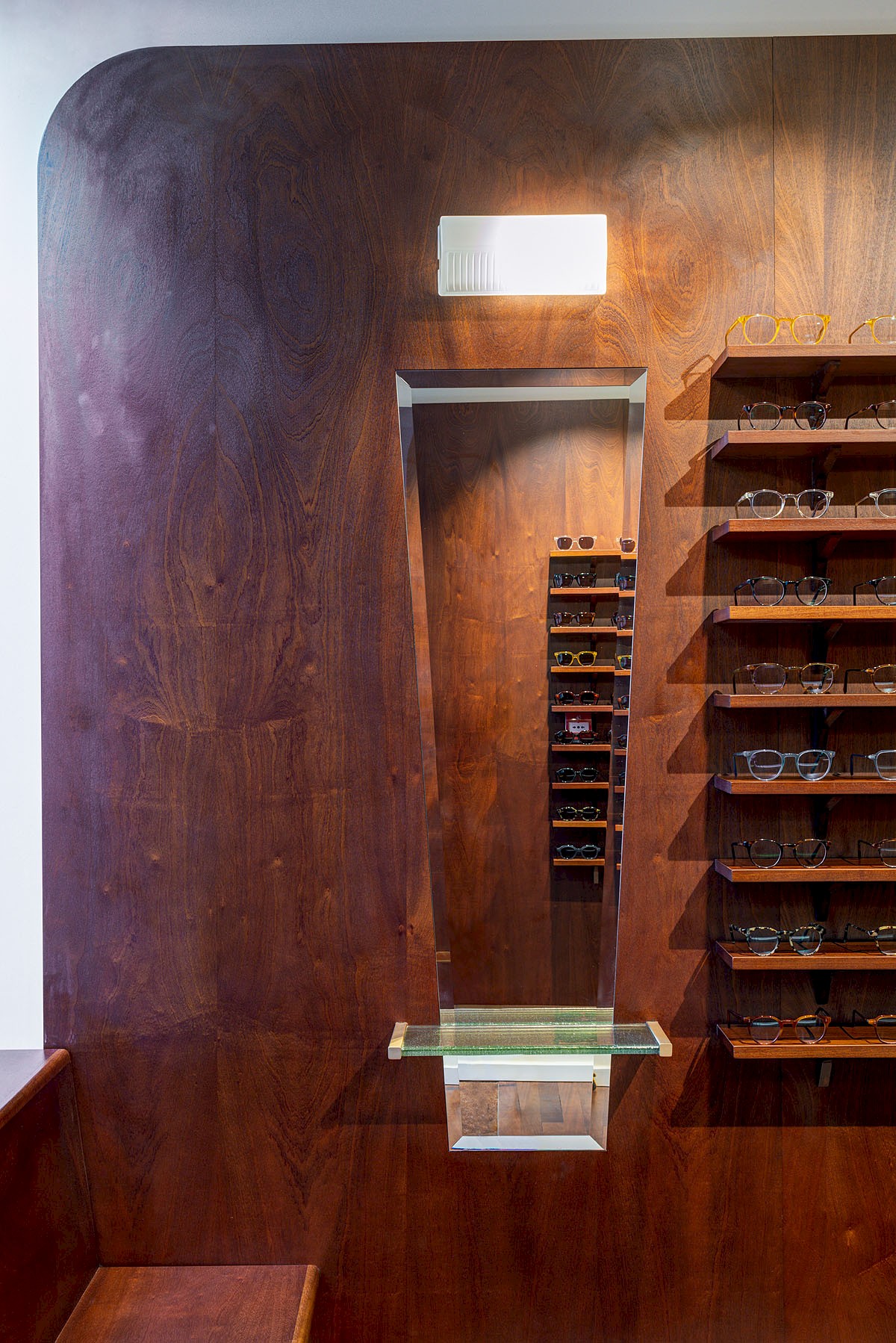
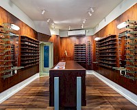
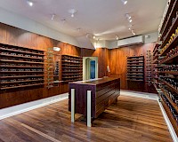
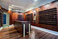
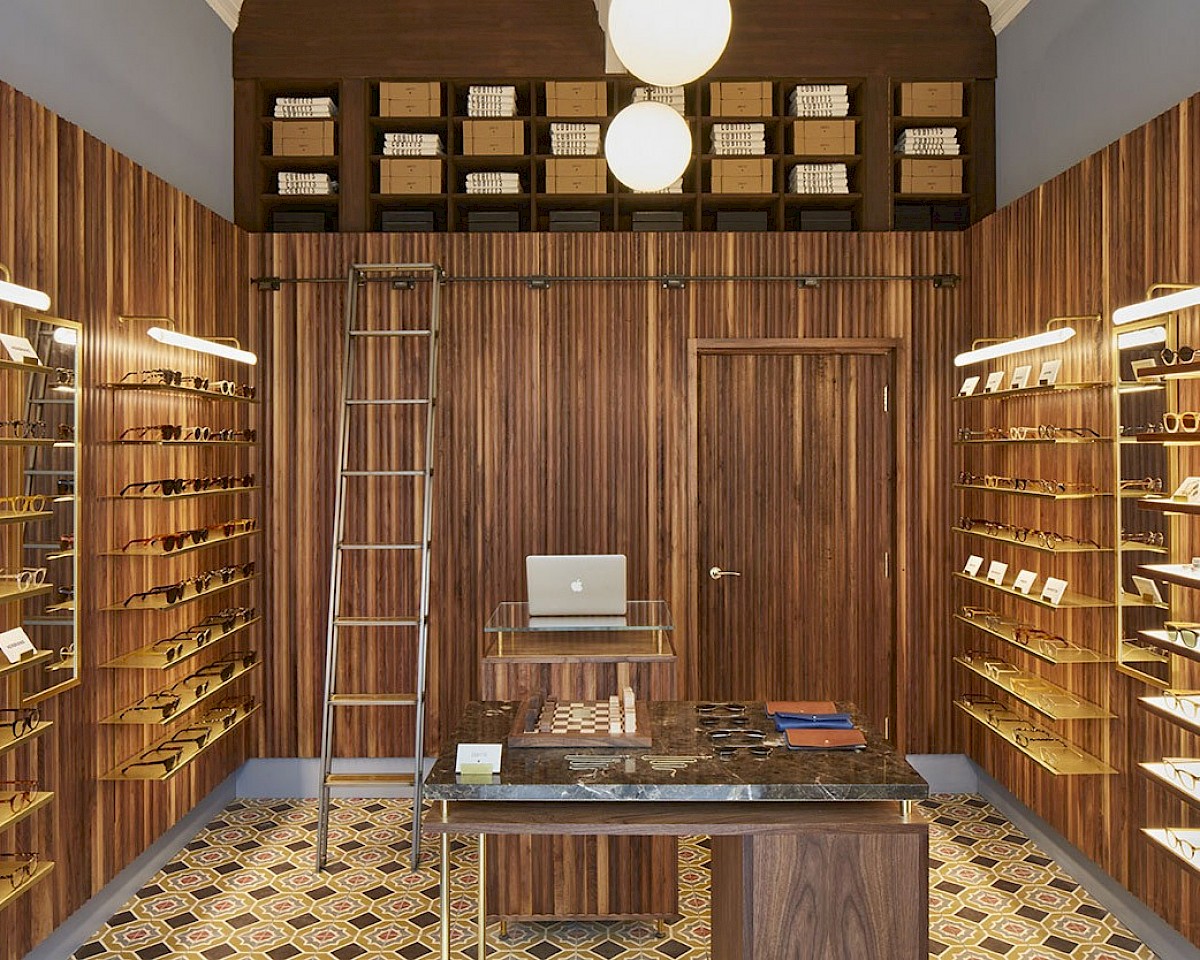
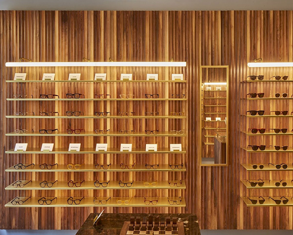
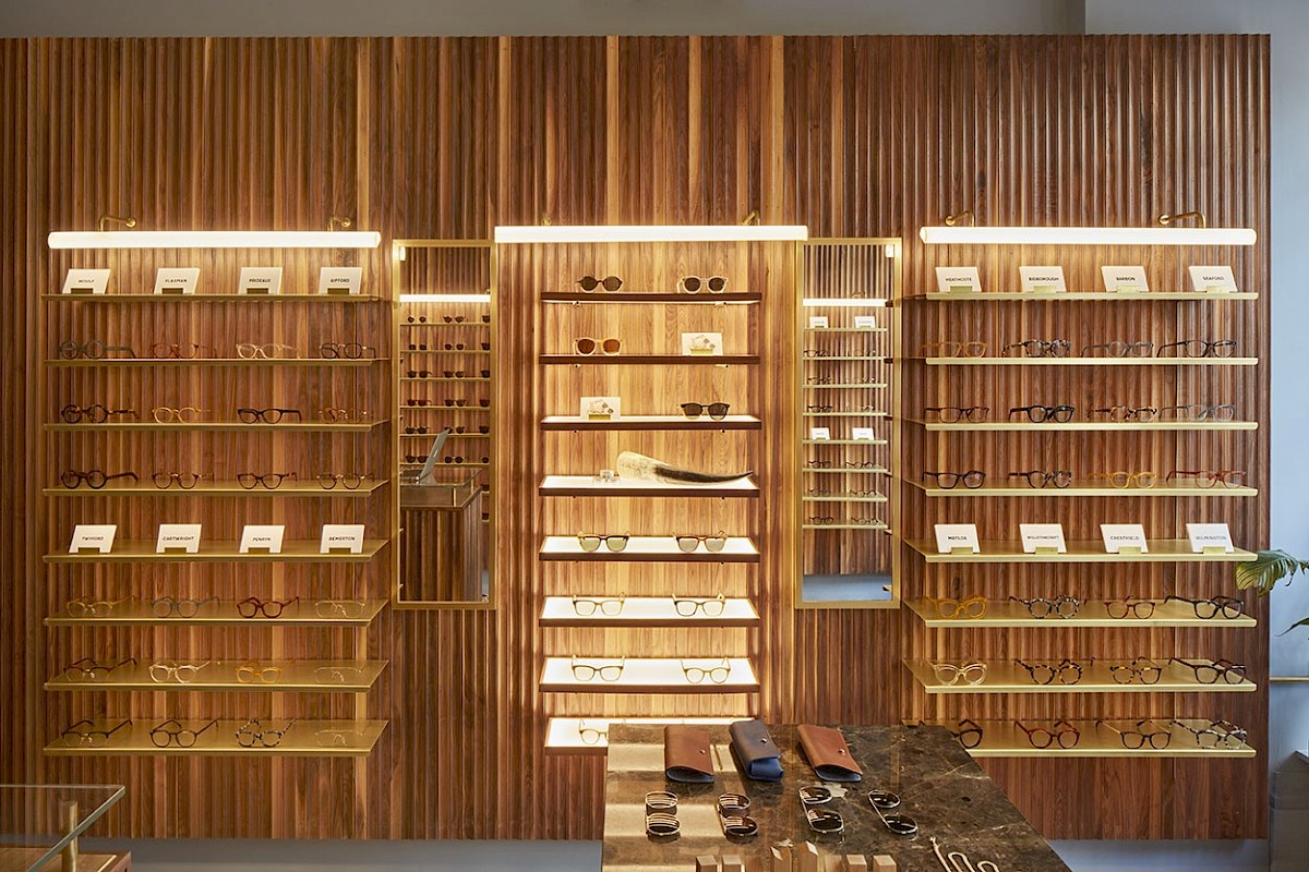
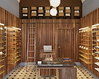
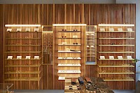
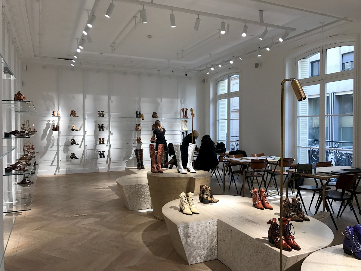
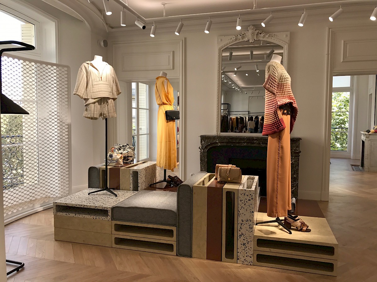
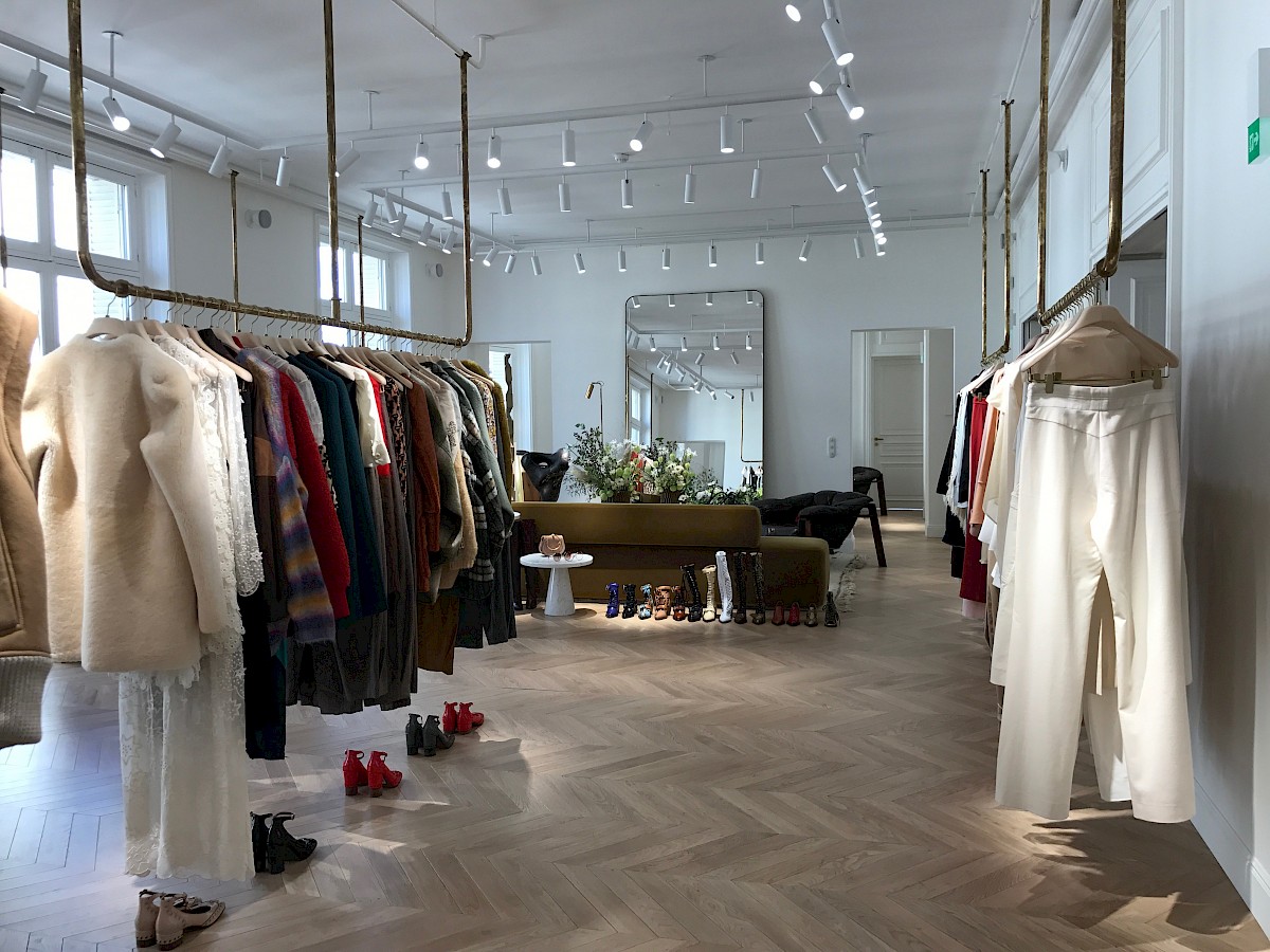
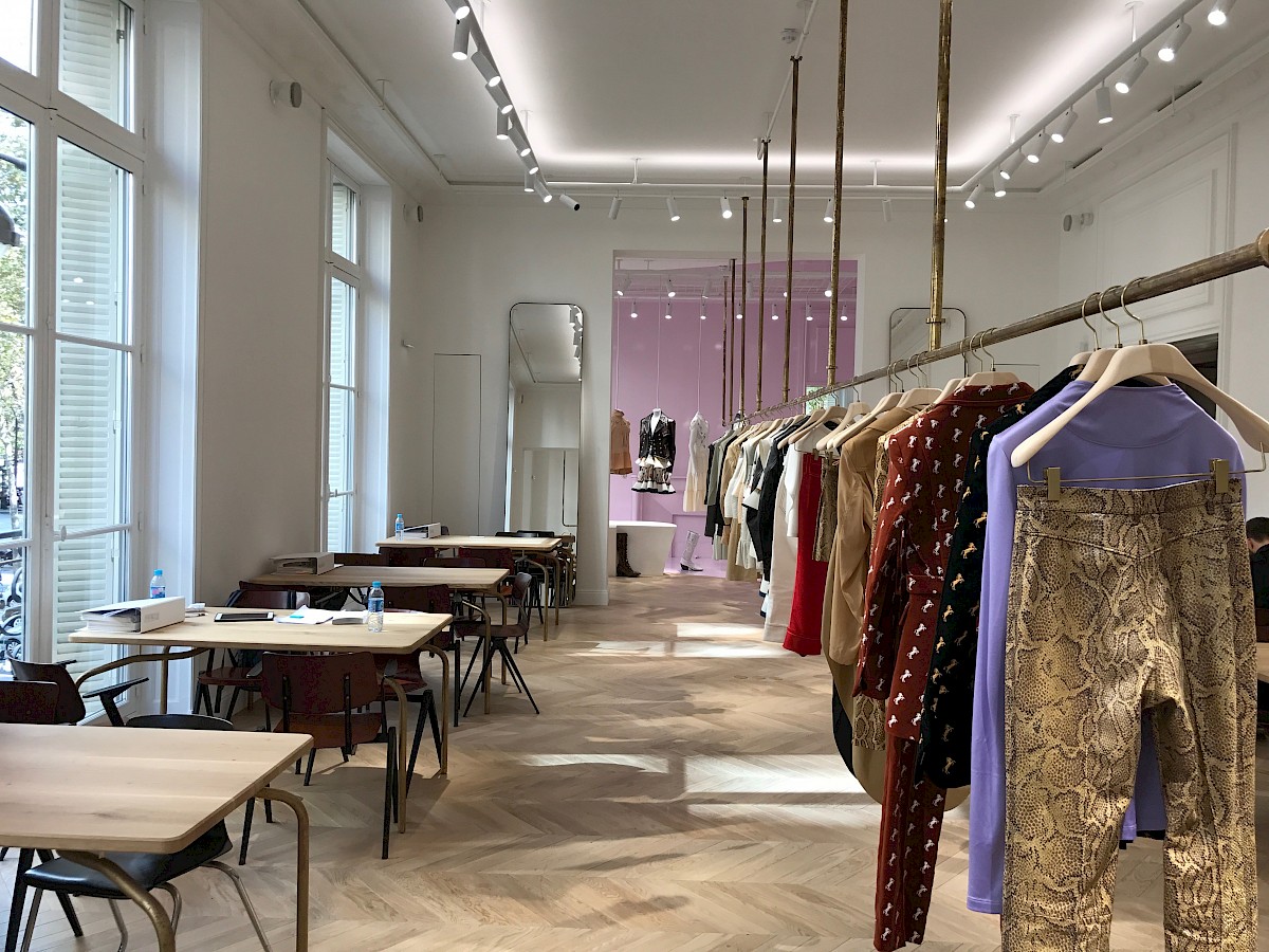
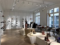
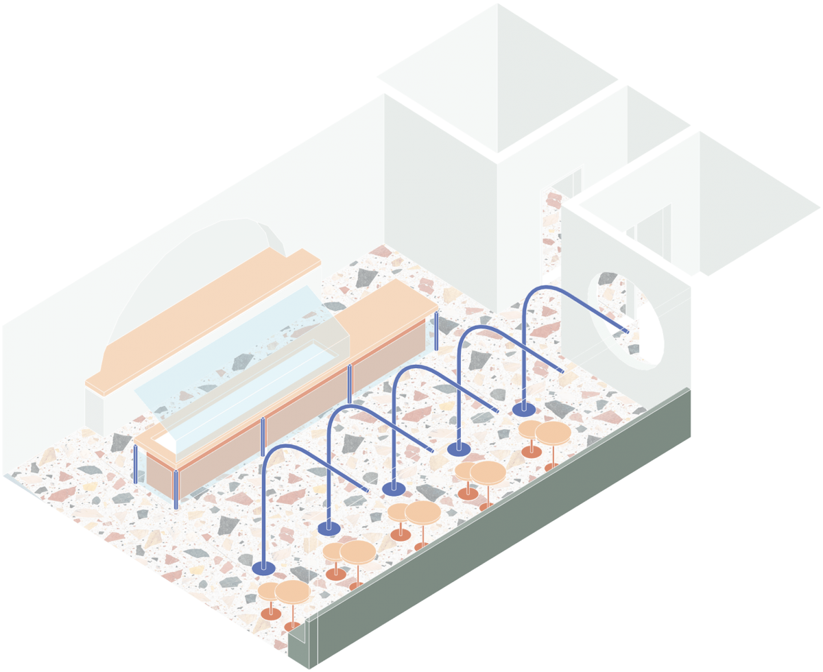
We first implemented these moments through our site co-ordination - the initial footprint was noticeably unbalanced, to which our response sought to re-introduce the symmetry of the exterior. The presentation of the store appears slightly shallower, echoing the effect of the grandiosity of the Hall outside, symmetry encouraging the onlooker to view the space as centrally coordinated. After establishing zoning and optimal positioning of the shelving, the form of which was heavily inspired by the predominantly linear elements of Art Deco, contrasting interesting curves and scallops breaking up the rigidity and encouraging visual interest.
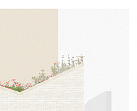
The spatial coordination was developed on the basis of using the store front as a central point of symmetry, creating a small but elaborate Art Deco arcade of fluted glass, establishing 4 clear zones to encourage circulation throughout the store, equally additionally drawing from the surrounding greek and Art Deco influences. Simple geometric shapes, adorned with minimal ornamentation, reminiscent of an industrial era of glamour.
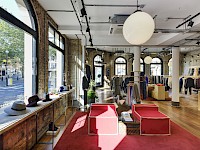
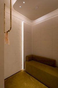
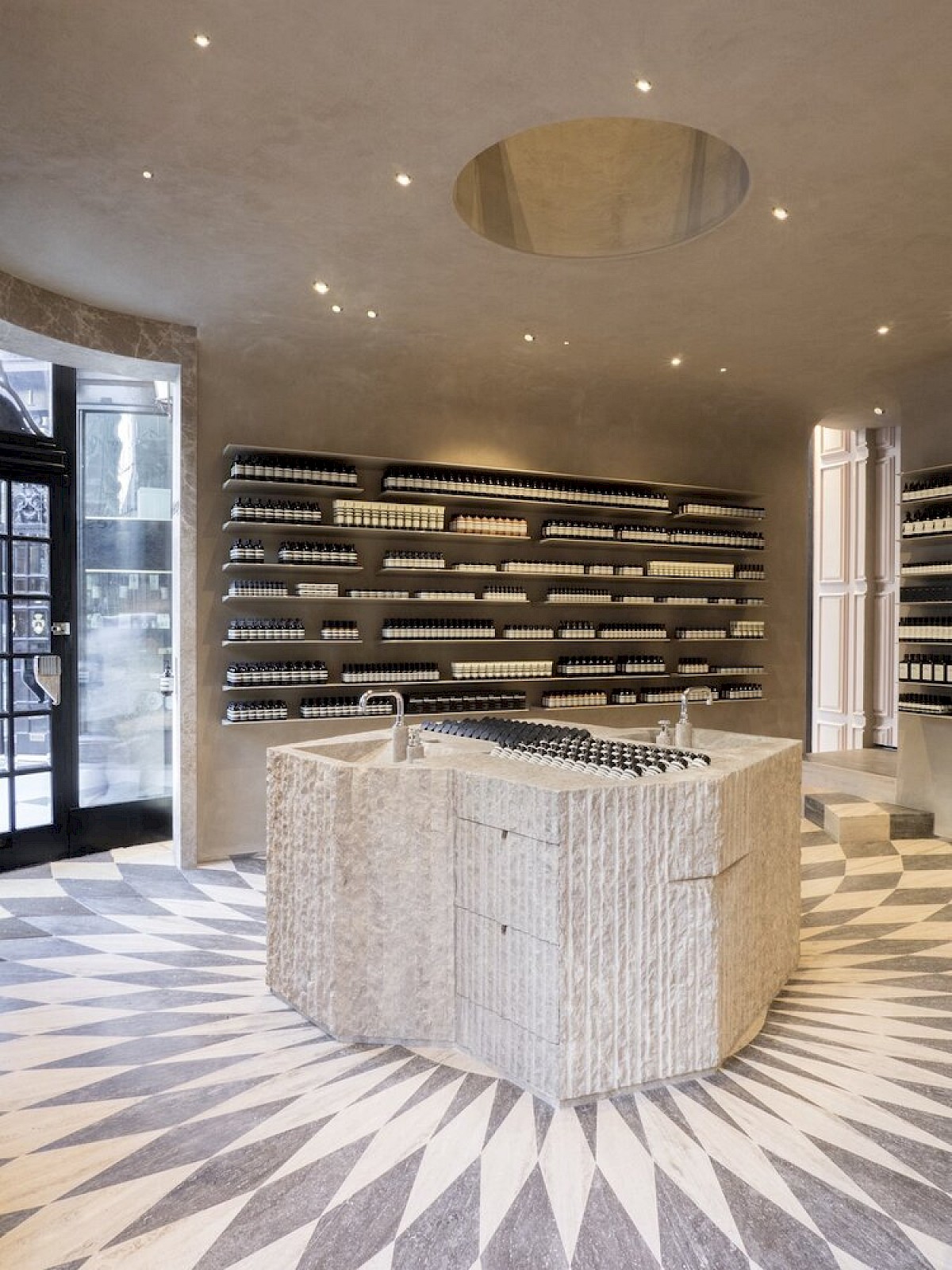
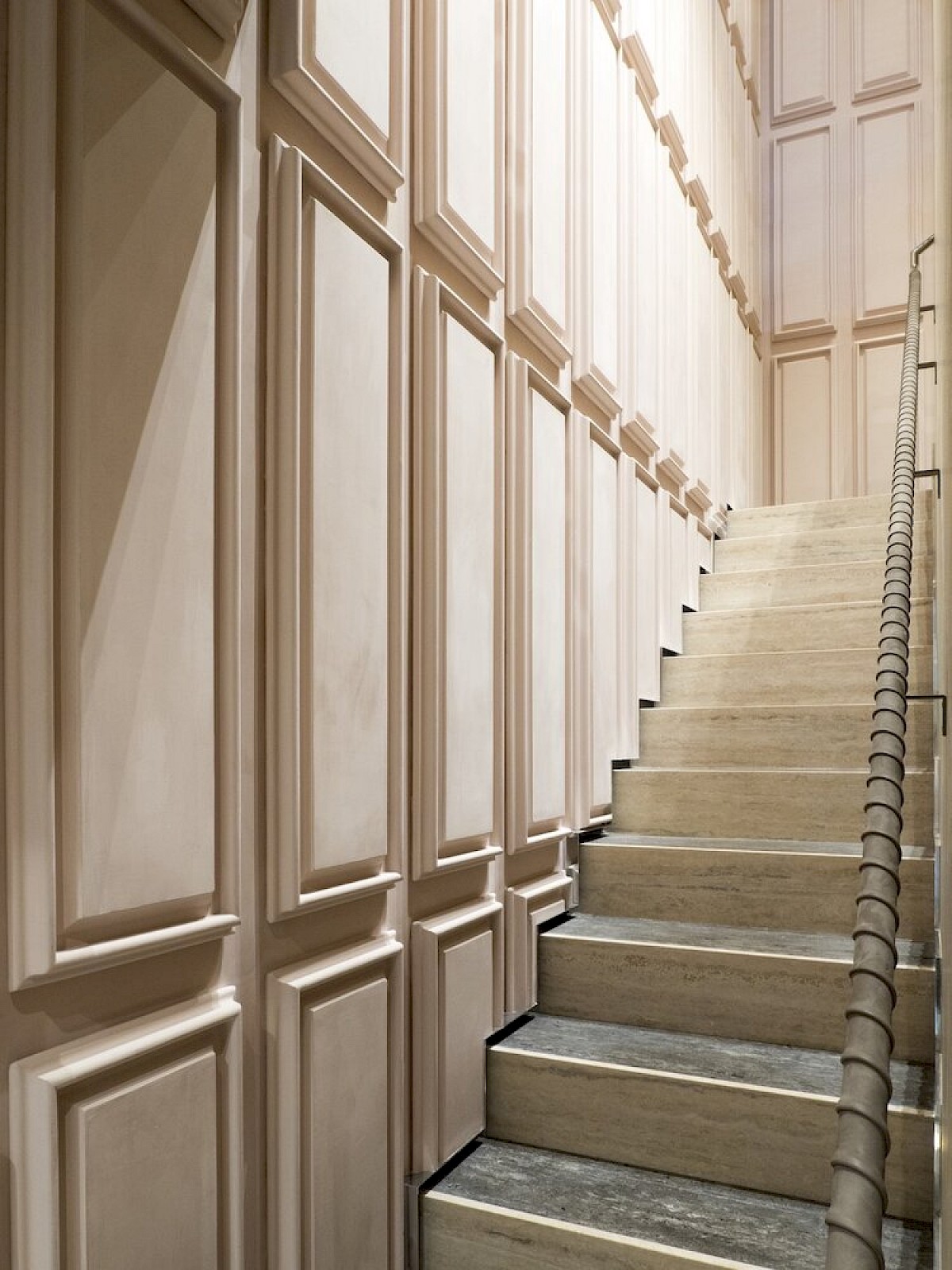
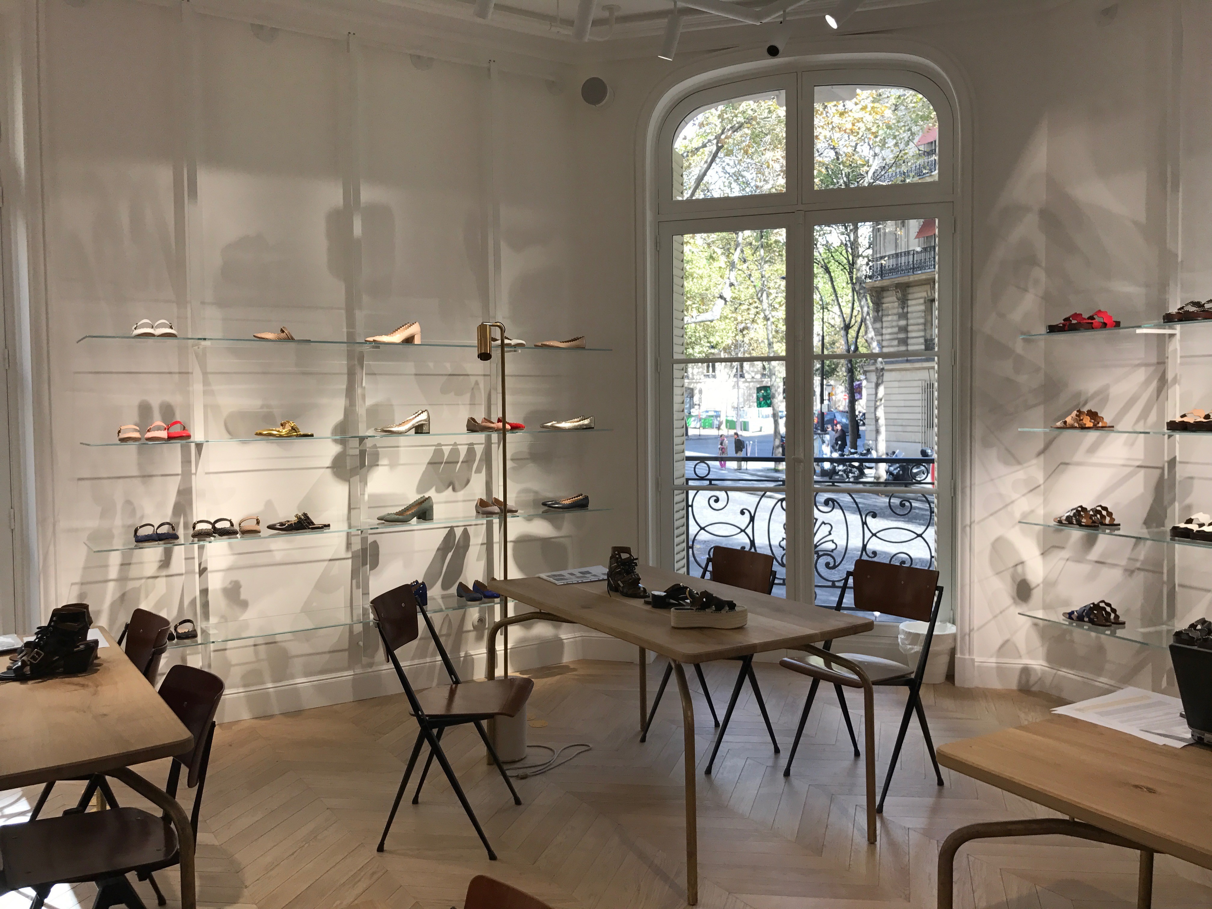
Additionally, there is a stepped ceiling that offers a subtle Art Deco nod, providing passive light to the store.
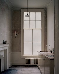
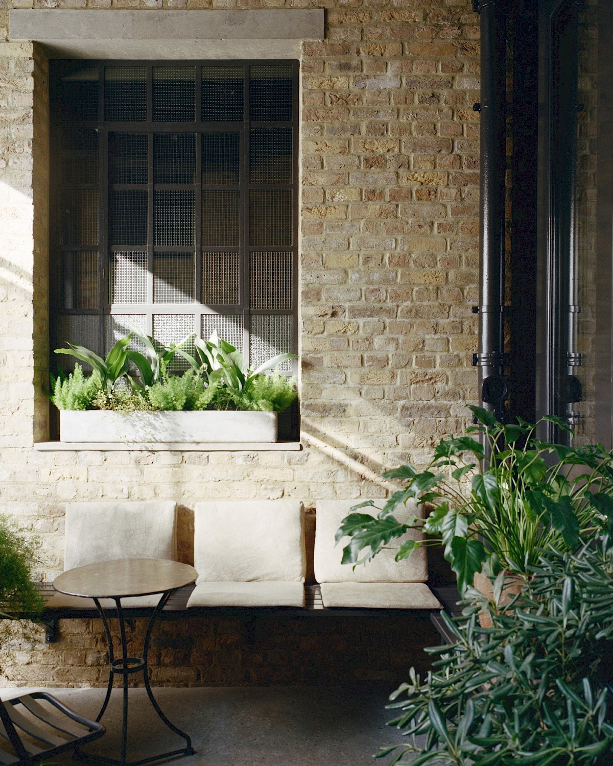
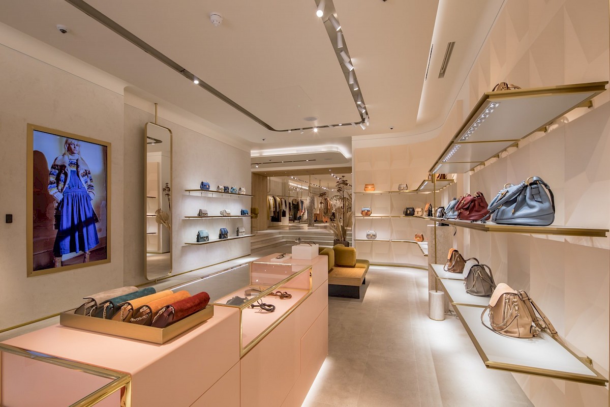
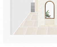
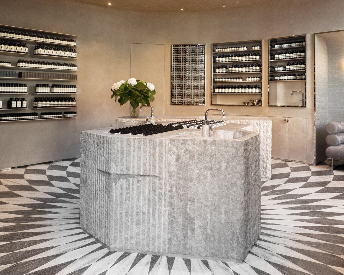
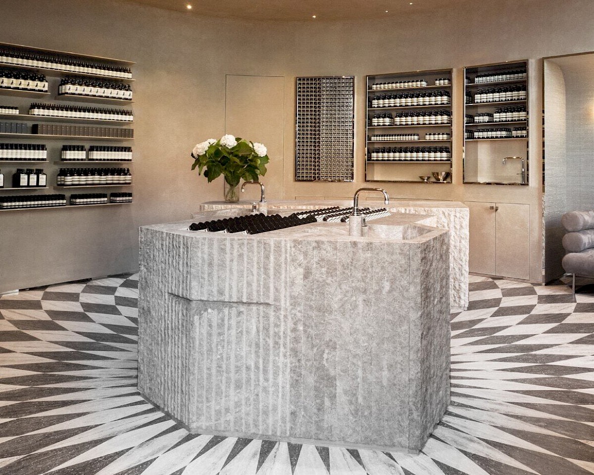
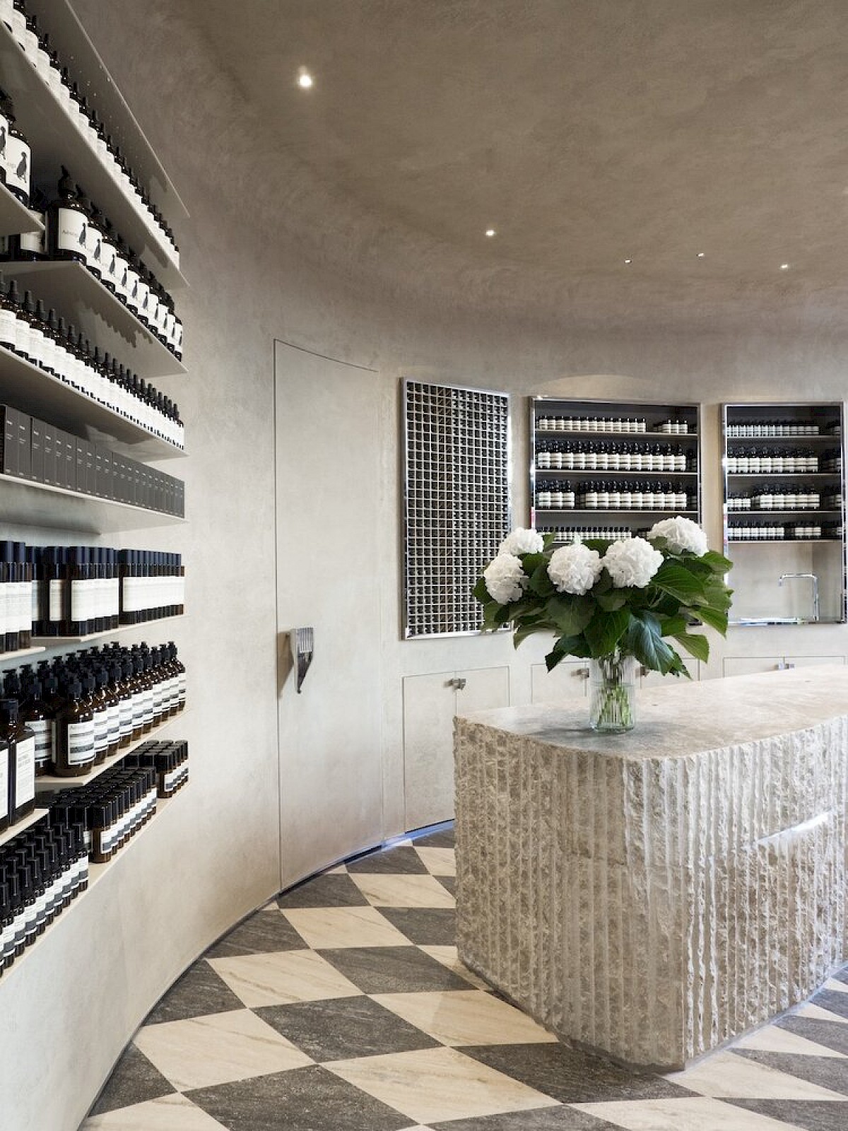
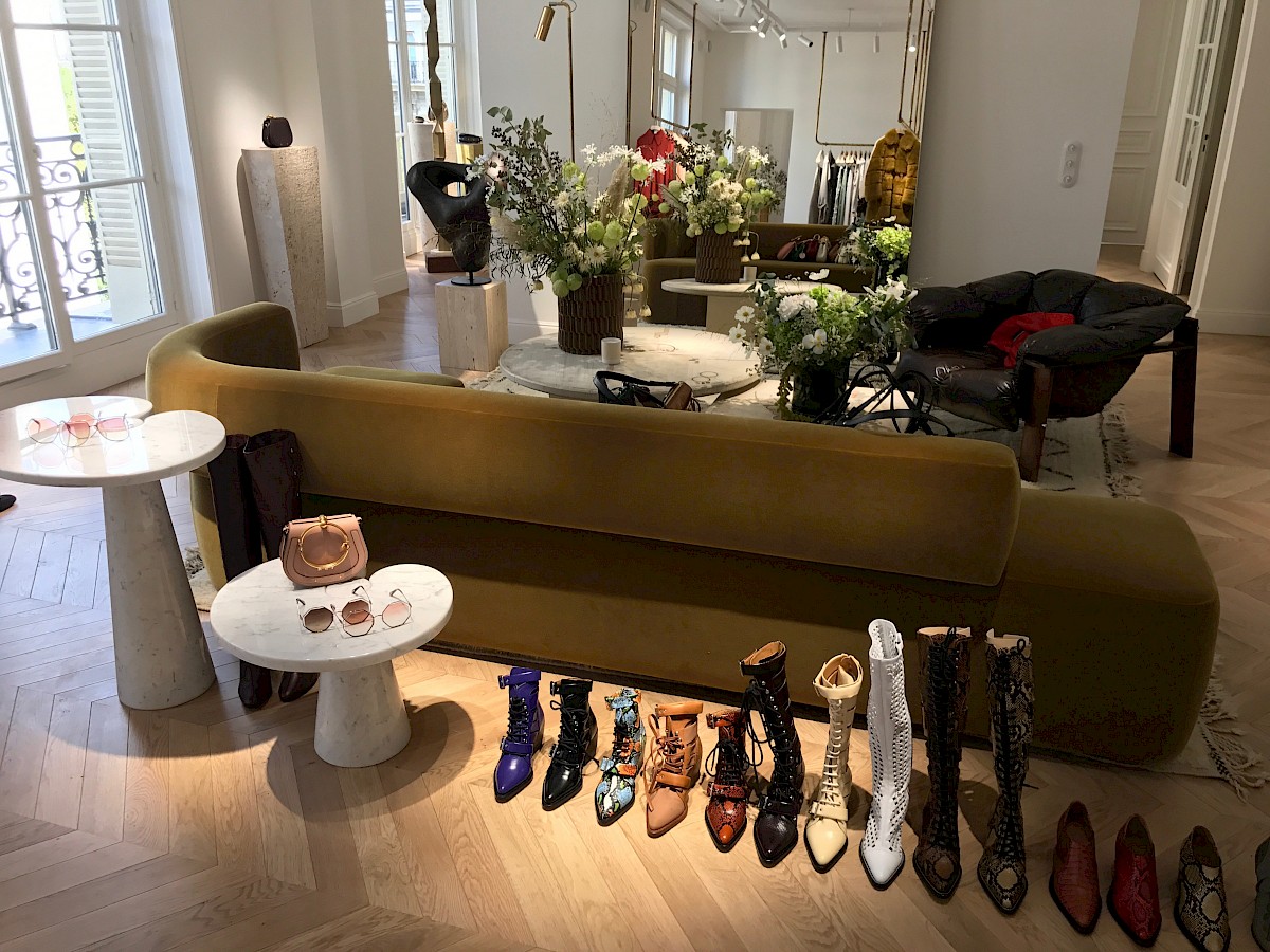
The Italian marble used in Turbine Hall A, combined by the natural lighting of the skylights above, creates soft beige - like tones, which we incorporated into our own colour palette.
“Continuing the lighting language established in the public realm spaces, Speirs Major chose a warm light (2700K), bringing to mind the original tungsten lighting of the period for both the functional and architectural lighting. Gentle highlights to the key details include uplighting the industrial gantries, the main soffit and friezes, and vertical accents to the Art Deco columns”. - Arc Magazine
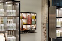
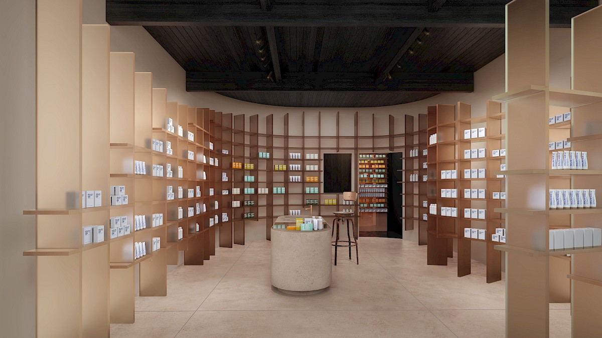
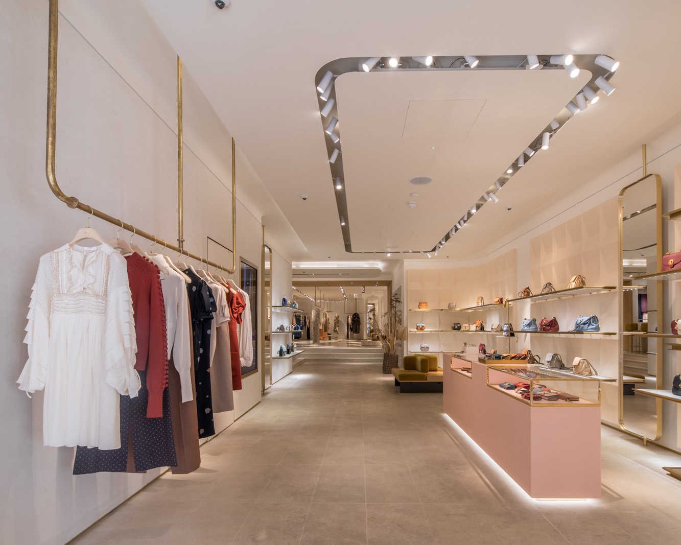
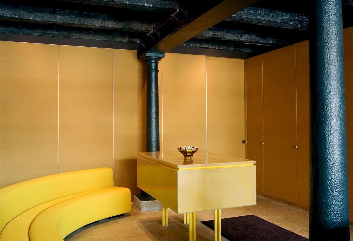
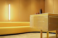
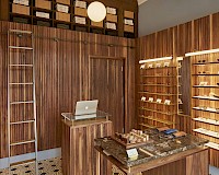
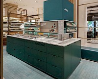
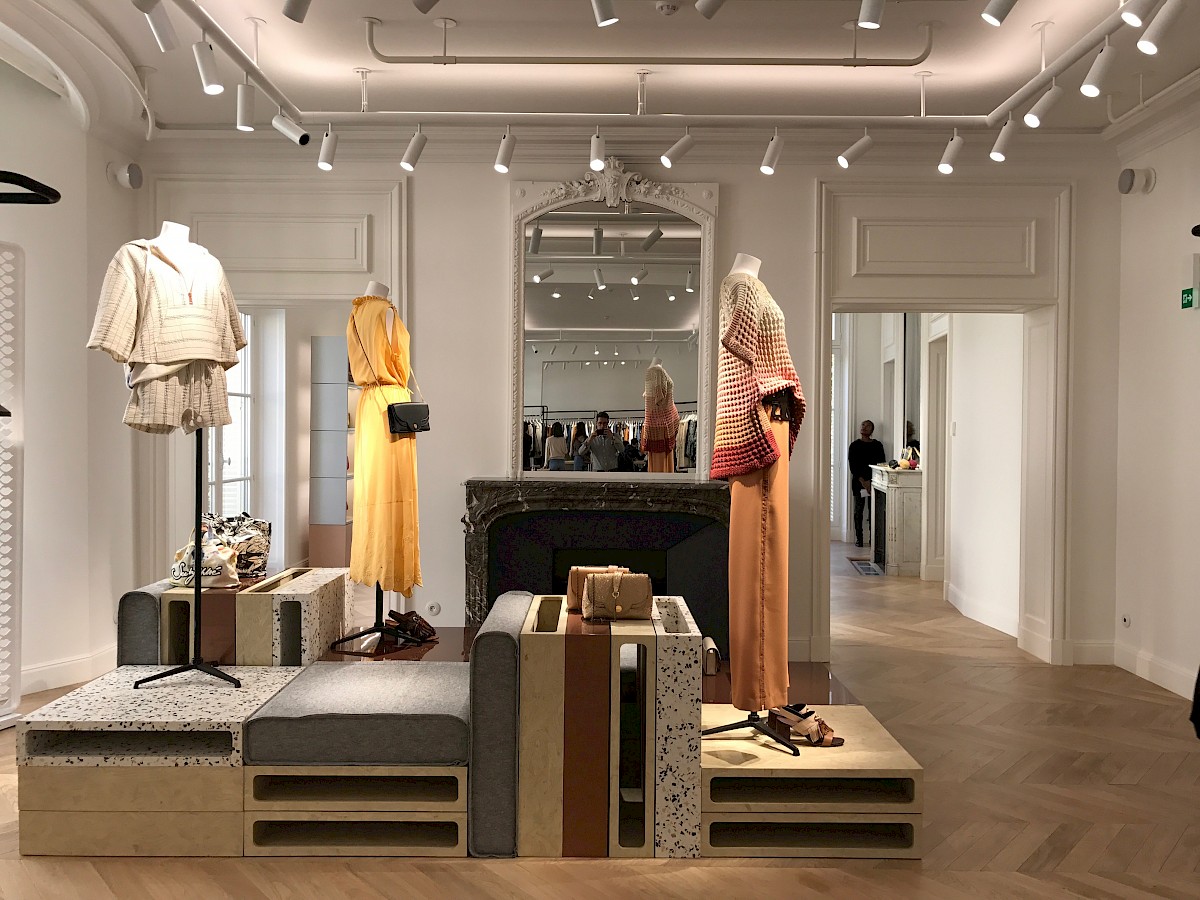
Taking some elements from our previous project working alongside Malin+Goetz, the project introduces a warm ‘mushroom’ toned colour scheme - informed further by the incredibly industrial Control Rooms, and their perfectly restored Art Deco panels and dials.
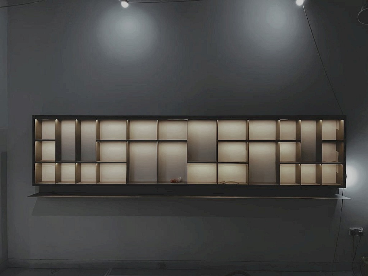
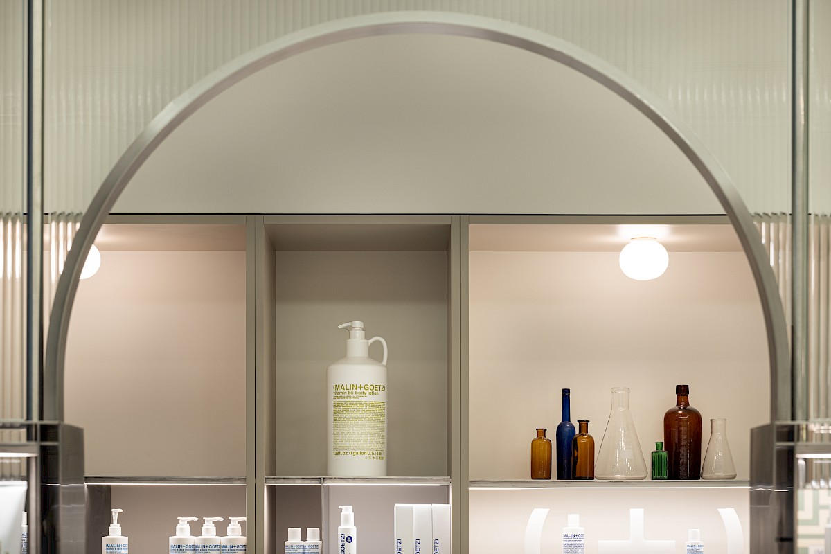
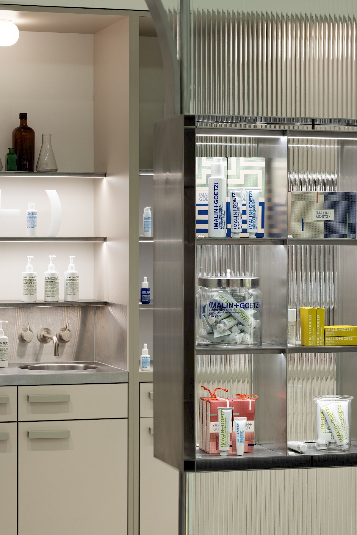
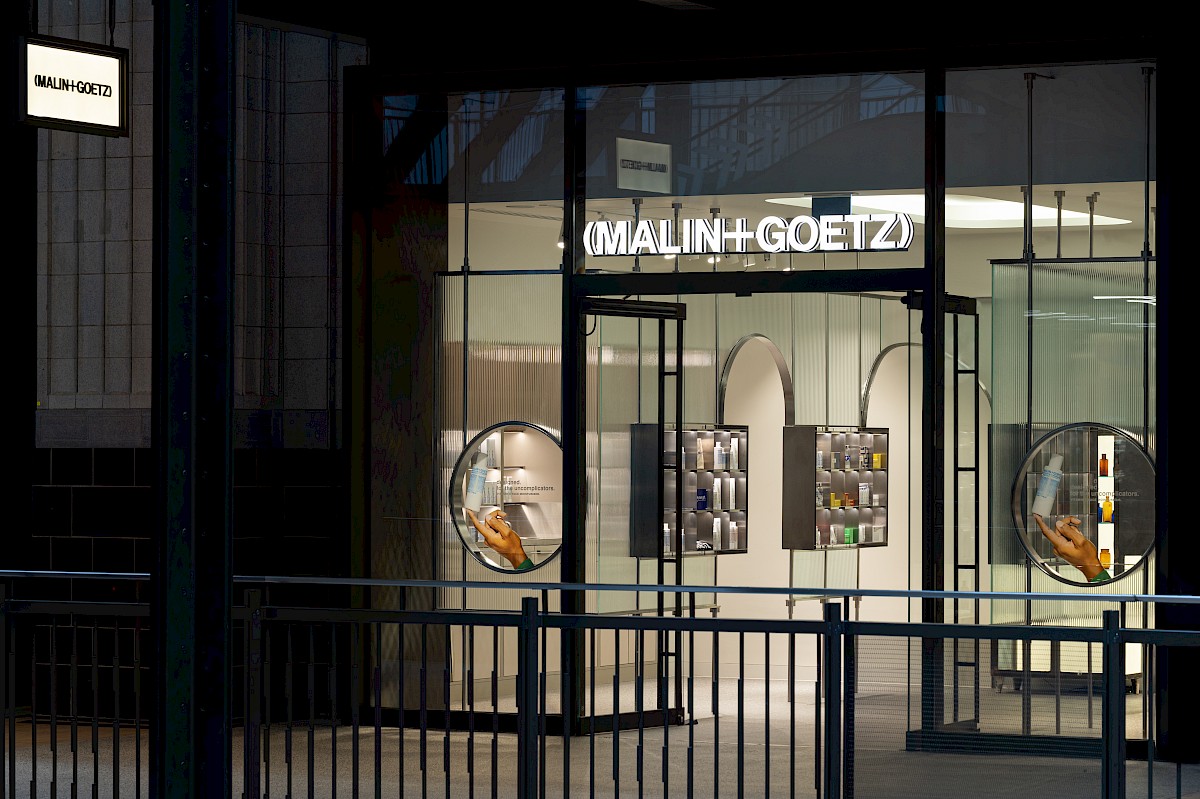
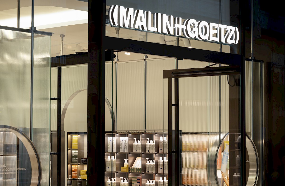
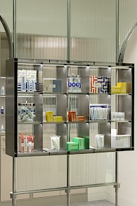
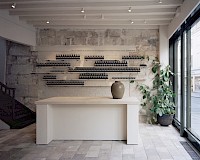
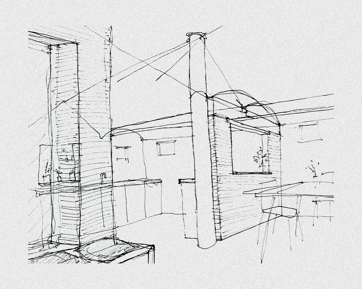
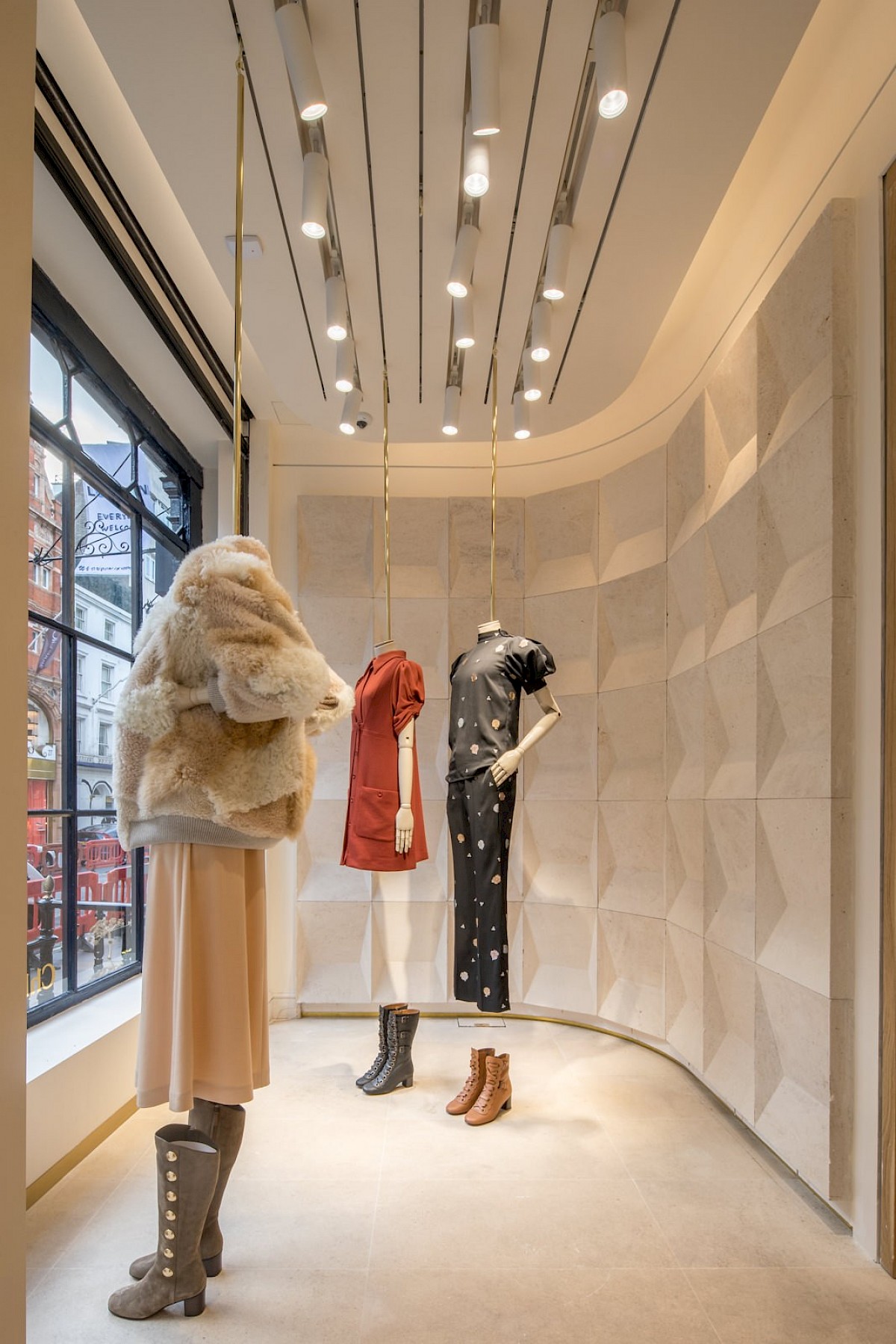
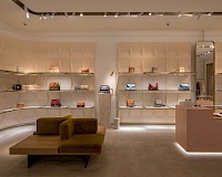
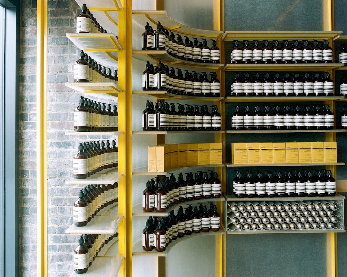
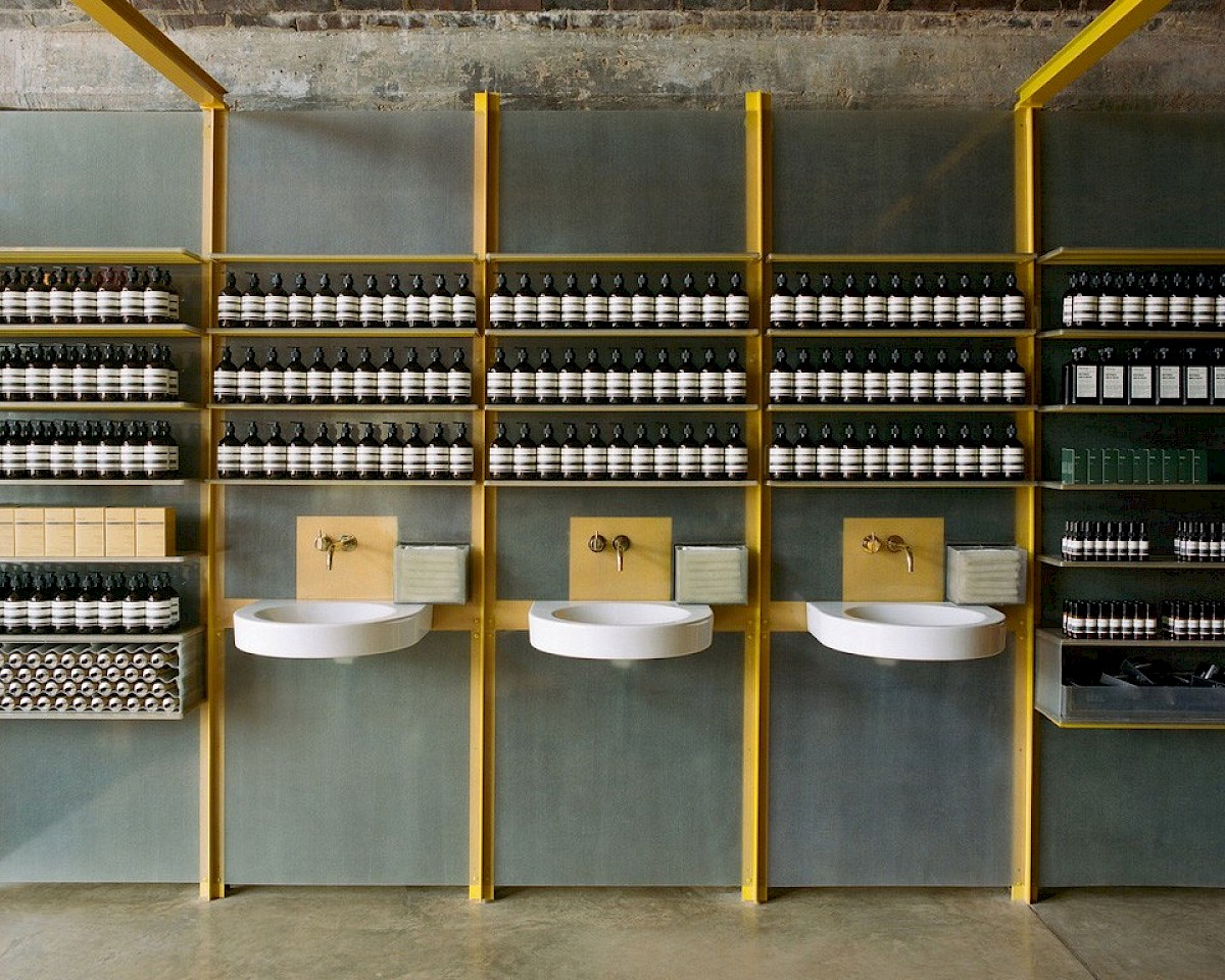
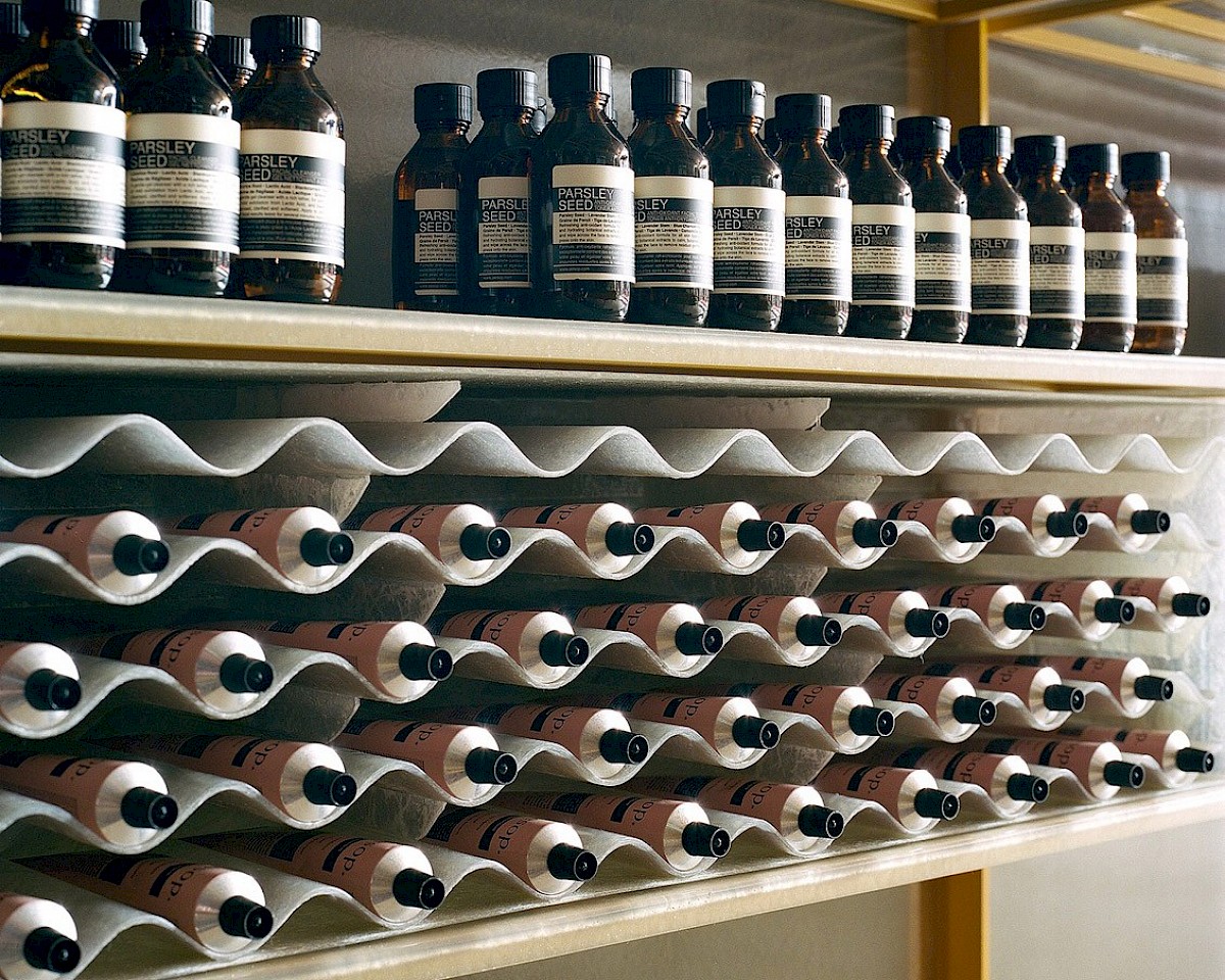
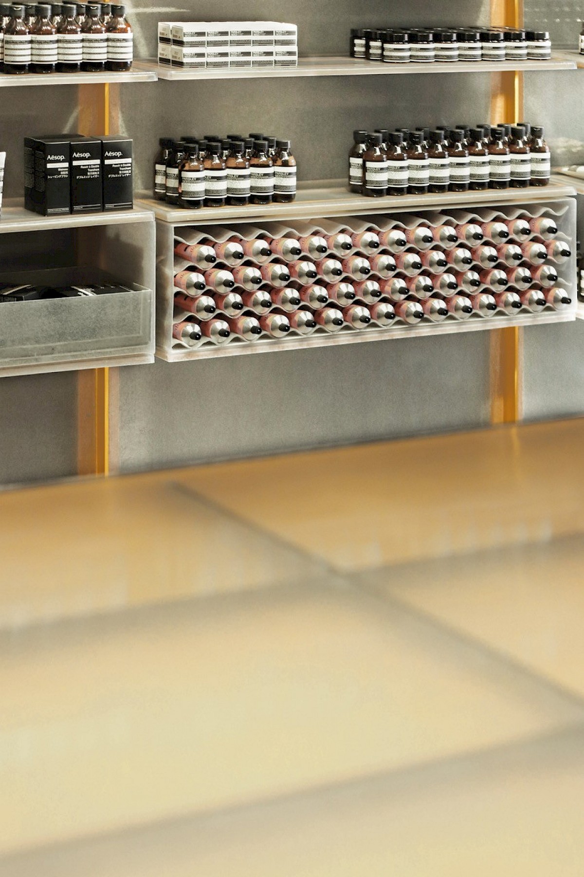
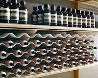
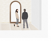
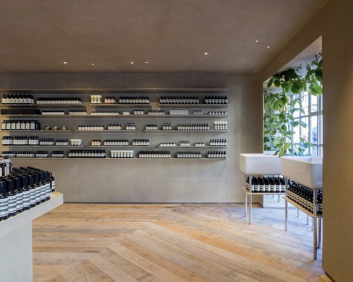
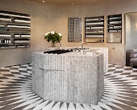
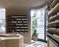
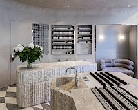
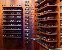
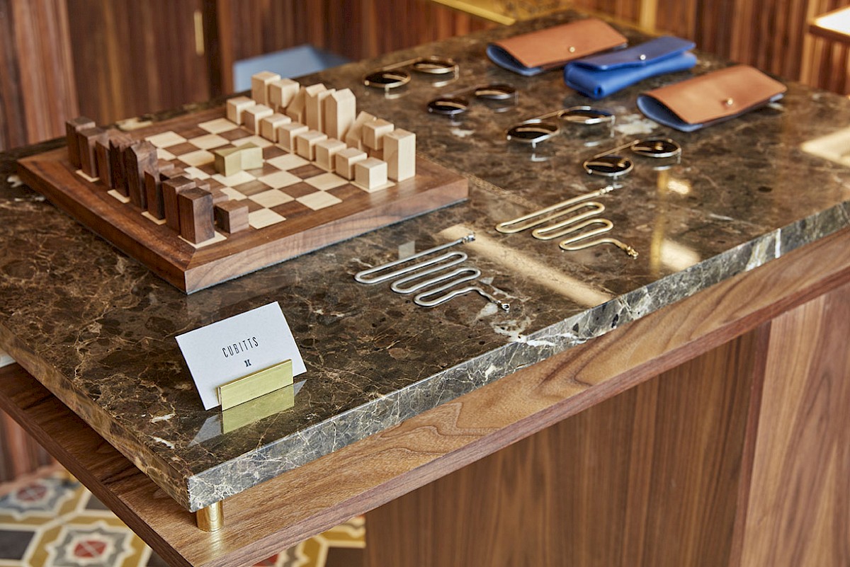
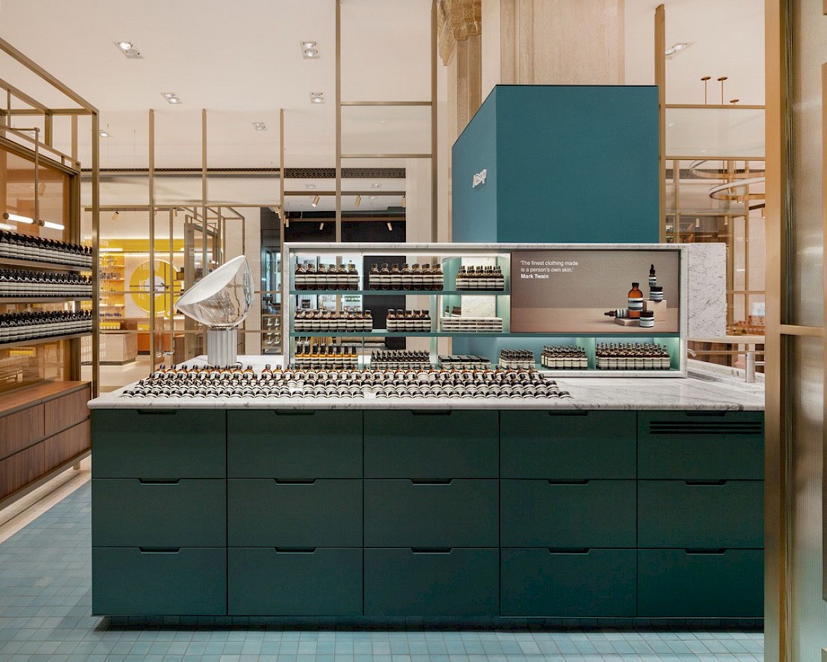
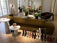
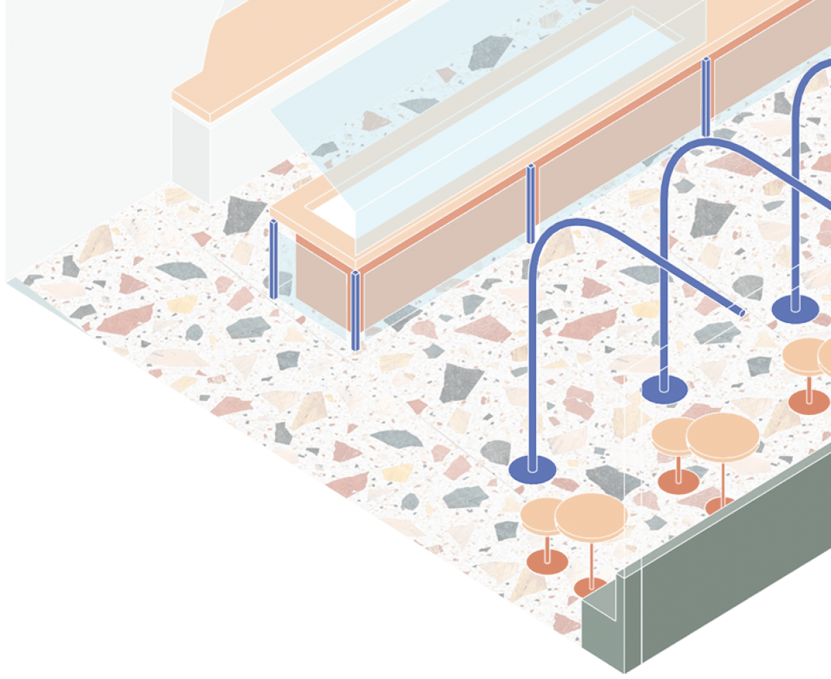
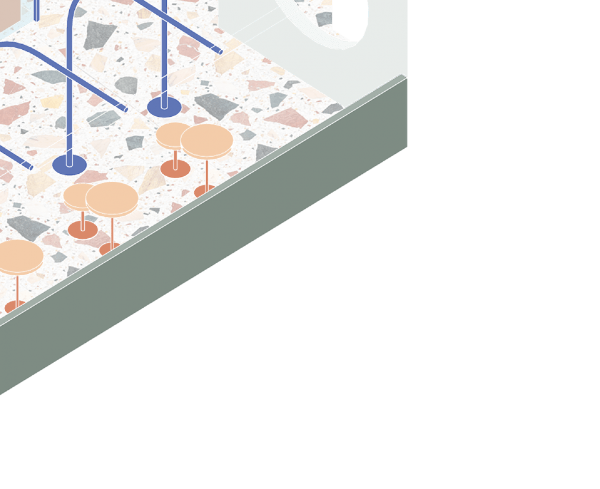
For our cabinetry, we incorporated a high quality laminate, to refer back to the era of the 1930s, with mustard-y, mushroom-y tones, and subtle Art Deco references in the distribution of the Consultation space, and fixtures, as well as clear information taken from the Control Rooms. The central furniture features 2 symmetrical portholes that house window displays, and juxtapose the rigidity of the glass tube structure surrounding it.
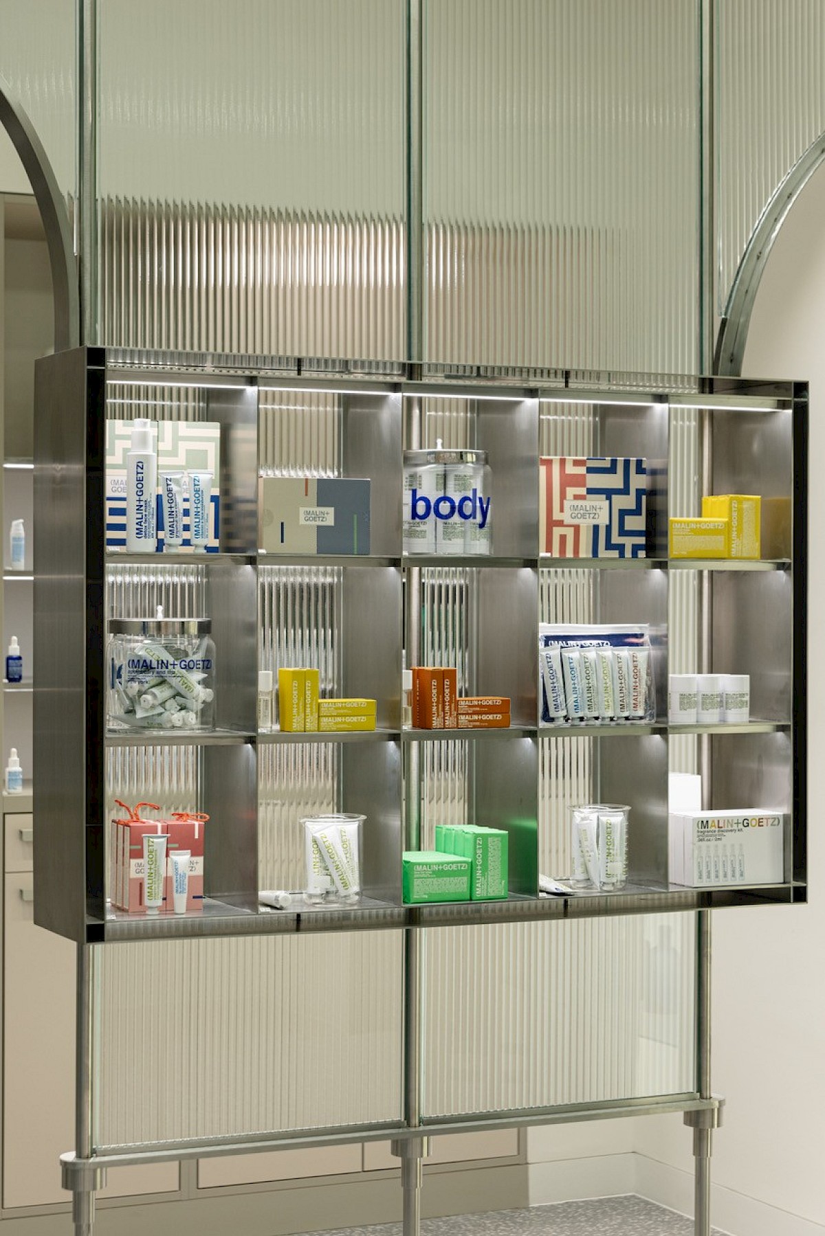
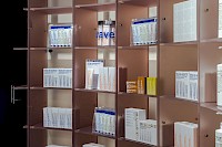
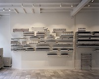
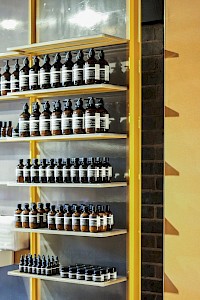
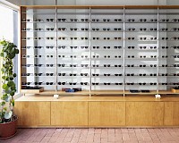
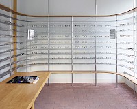
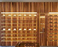
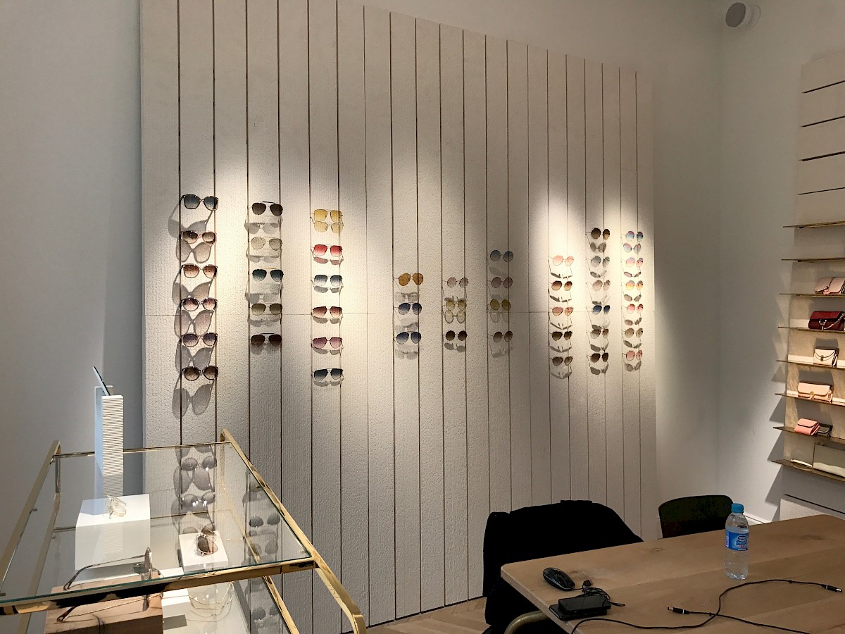
The central shelving dramatically contrasts the glass tubes, cleverly designed to appear as though floating.
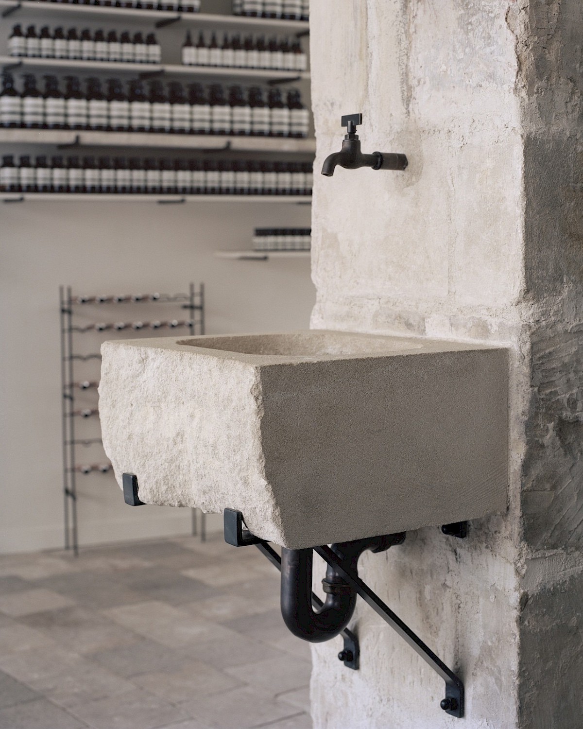
Stainless steel with aged, nickel-like effect, to appear as though it has dulled over time, the purposeful illusion of an installation having the permanence of somewhat a relic, or a aged ruin, much like the Power Station itself before it was reclaimed by the architects who had dutifully restored it.
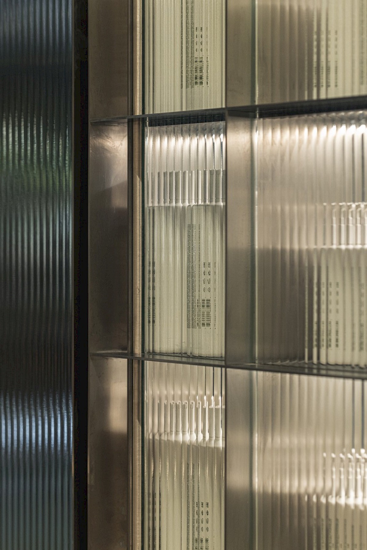
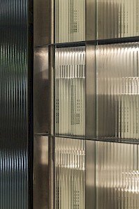
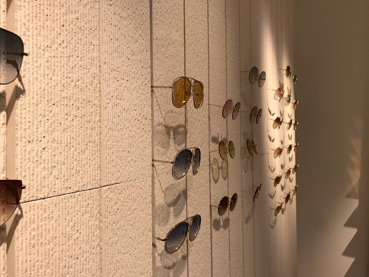
The ‘fluted’ glass - characteristic of the grandeur of high society Art Deco interiors -(such like the ‘Jazz Modern’, and the grandiosity of the Control Room, and it’s beautifully polished parquet, which was to only be stepped on using felt slippers so not to scuff the elaborate flooring), offers a semi-translucent partition between ‘zones’, in addition to an interesting visual, the regular 50mm interruptions leaving the store seemingly open, and encouraging circulation, enabling visibility with intrigue.
The stainless steel rails supporting the glass tubes echo ceiling suspended racks in factories, such like the ones visible in both Turbine Halls.